If I had to boil this down to one point, it’s this: investors care less about raw growth and more about whether revenue stays. A company with NRR above 100%, GRR above 90%, and clear cohort trends will often look stronger than a faster-growing company with weak retention.
Here’s the short version:
- I’d track four numbers first: logo retention, logo churn, GRR, and NRR
- I’d keep new customers out of GRR and NRR
- I’d show retention by segment, especially if SMB and enterprise behave differently
- I’d use cohort tables and an ARR/MRR bridge so investors can see what changed
- I’d keep definitions, dates, and rules the same every quarter
A few benchmarks matter right away:
- Series A: often 85–90%+ GRR and 100–110%+ NRR
- Series B+: often 90–95%+ GRR and 115–130%+ NRR
- SMB SaaS: can still work with higher churn if payback is short
- Enterprise SaaS: usually needs lower churn and stronger expansion
Here’s a fast comparison:
| Metric | What it shows | What investors look for |
|---|---|---|
| Logo retention | How many customers stayed | Product stickiness |
| Logo churn | How many customers left | Early retention risk |
| GRR | Revenue kept before upsell | Revenue durability |
| NRR | Revenue kept after upsell | Expansion vs. churn |
The main job in investor reporting is simple: show that customers stay, revenue holds up, and expansion can offset losses. If I can show that with clean numbers and a consistent format, the retention story is much easier to trust.
The Metrics that Matter to Investors | SaaS Metrics School
sbb-itb-17e8ec9
Core Retention Metrics Investors Expect
Investors usually look at four retention metrics in recurring-revenue reporting: logo retention, logo churn (customer churn), GRR, and NRR. Some track customer count. Others track recurring revenue. Both matter, but they answer different questions.
Logo-based metrics show how many customers stayed or left during a given period. Revenue-based metrics show how much recurring revenue stayed, shrank, disappeared, or grew.
Logo Retention and Logo Churn (Customer Churn)
Logo retention and logo churn show how many customers are staying with you, separate from how much each account spends. The math is simple:
- Logo churn (customer churn) = Customers lost during the period ÷ Customers at the start of the period
- Logo retention = Customers retained at the end of the period ÷ Customers at the start of the period
Say you start Q2 2026 with 400 customers and 40 cancel during the quarter. That works out to 10% logo churn and 90% logo retention for the period.
For SMB-heavy businesses, monthly churn is usually the better view. For enterprise accounts, annual or trailing-12-month views tend to make more sense. That difference matters because investors don't compare SMB and enterprise retention the same way.
Early on, logo metrics carry extra weight. They help investors judge stickiness and product-market fit.
GRR and NRR: Formulas and Definitions
GRR and NRR move from customer count to revenue behavior. And there's one rule you can't miss: both metrics use existing customers only. New logos do not count.
Gross Revenue Retention (GRR) shows how much recurring revenue you kept after cancellations and downgrades. Upsells don't help this number.
GRR = (Starting recurring revenue – Churn – Contraction) ÷ Starting recurring revenue
Net Revenue Retention (NRR), also called net dollar retention (NDR), adds expansion back in:
NRR = (Starting recurring revenue – Churn – Contraction + Expansion) ÷ Starting recurring revenue
Here's a plain-English Q2 2026 example using U.S. formatting. Suppose your existing customers generated $100,000 ARR on April 1, 2026. During Q2:
- $8,000 churned from cancellations
- $7,000 contracted from downgrades
- $20,000 came from upsells on those same accounts
New logo ARR of $15,000 is excluded entirely.
So the math looks like this:
- GRR = ($100,000 – $8,000 – $7,000) ÷ $100,000 = 85%
- NRR = ($100,000 – $8,000 – $7,000 + $20,000) ÷ $100,000 = 105%
GRR is always ≤ NRR because GRR gives no credit for expansion. In this example, 85% GRR points to churn and downgrade pressure. Meanwhile, 105% NRR looks strong because upsells offset those losses. That's the kind of gap investors notice right away. It often leads to follow-up questions about revenue quality.
Side-by-Side Metric Comparison
| Metric | What It Measures | Basis | Primary Investor Use |
|---|---|---|---|
| Logo Retention | % of customers retained over a period | Count-based | Assessing product stickiness and PMF |
| Logo Churn (Customer Churn) | % of customers lost over a period | Count-based | Spotting early warning signs of attrition |
| GRR | % of recurring revenue kept (no expansion) | Revenue-based | Measuring pure revenue durability and downgrade risk |
| NRR / NDR | % of recurring revenue kept and grown from existing customers | Revenue-based | Evaluating land-and-expand motion and valuation quality |
A company can post 95% logo retention and still show only 80% GRR. In plain terms, most customers stayed, but downgrades pulled revenue down hard. Investors will see that as a revenue quality problem, even if the customer count looks fine.
Taken together, these metrics help investors see whether retention tells a product story, a revenue story, or both. The next step is to stack those numbers against stage-based retention benchmarks.
Benchmarks and Stage-Specific Expectations
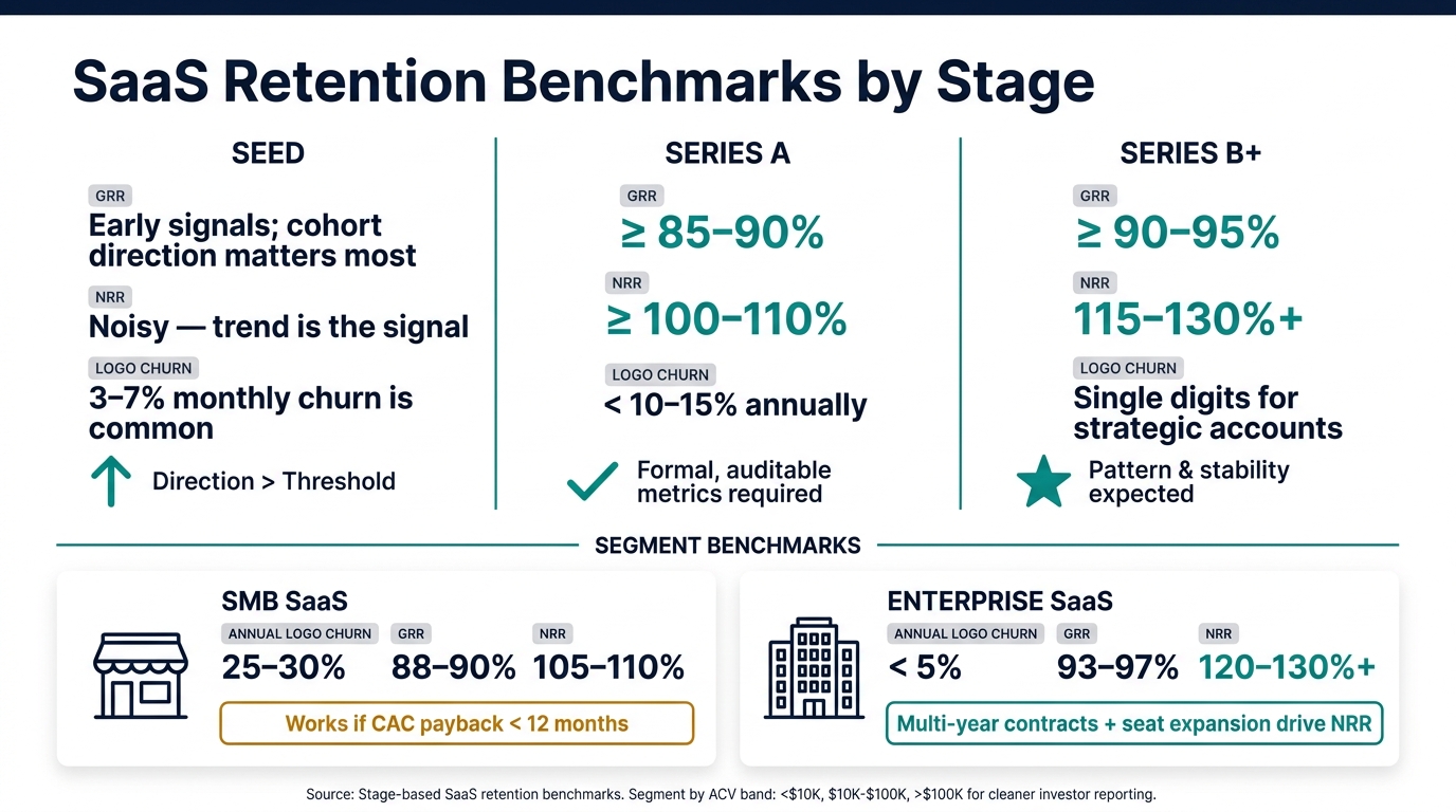
SaaS Retention Benchmarks by Stage: GRR, NRR & Logo Churn
Retention benchmarks change with stage, segment, and sales motion. Use them as a filter, not a headline. Investors want context, not just a percentage on a slide. And as a company grows up, the bar gets higher.
What Good Retention Looks Like by Stage
| Stage | GRR | NRR | Logo Churn |
|---|---|---|---|
| Seed | Early signals; improving cohorts matter more than formal thresholds | Noisy at this stage; direction counts | Monthly logo churn of 3–7% is common; improvement trend is the signal |
| Series A | ≥ 85–90% | ≥ 100–110% | Under 10–15% annually for core segments |
| Series B+ | ≥ 90–95% | 115–130%+ | Single digits for strategic accounts |
At Series A, investors expect formal, auditable GRR and NRR. If definitions shift from one deck to the next, that points to weak operating discipline, even if the top-line numbers look strong.
By Series B and later, NRR below about 110% is more often seen as a warning sign for enterprise-focused SaaS. What gives investors comfort isn't just one good quarter. It's a pattern. If GRR moves from the low 80s toward 90%+ across several quarters, and the company can explain which product or customer success moves drove each step up, that tells a much stronger story about where retention is headed once new capital goes to work.
The next issue is simpler than it sounds: should the company be judged by SMB standards or enterprise standards?
How SMB and Enterprise Retention Differ
SMB and enterprise SaaS run on very different retention math, so investors don't grade them the same way.
Healthy SMB SaaS may post annual logo churn of 25–30%, GRR around 88–90%, and NRR around 105–110%. That can still work if CAC payback is short - under 12 months - the market is big, and retention is moving in the right direction. Healthy enterprise SaaS tends to look very different: annual logo churn below 5%, GRR of 93–97%, and NRR of 120–130%+, often pushed by seat growth, multi-year contracts, and workflows customers don't want to rip out.
Blended retention can muddy the picture. A mixed SMB and enterprise business might show a blended NRR of 115%, but that number can hide a lot. Maybe a handful of large enterprise accounts are doing the heavy lifting while SMB churn is quietly eating away at the base. That's the kind of thing an investor will zoom in on right away.
The clean fix is segment-level reporting. Break retention out by ACV band - say, under $10,000, $10,000–$100,000, and above $100,000 - or by sales motion. That answers the question before anyone has to ask it, and it shows where the business is strong and where it's exposed.
These benchmarks only help if you can show them clearly in cohorts and bridges. Next, show these benchmarks with cohort tables and ARR/MRR bridges.
How to Present Retention Data in Investor Reports
Once you’ve set your benchmarks, the next job is simple: make them easy to scan. Investors move fast. If they have to hunt for the point, the point gets lost.
Benchmarks only help if someone can verify them at a glance in the board deck. That’s why cohort tables, ARR/MRR bridges, and a fixed board-deck structure work so well. They make the story plain.
Cohort Tables That Show Retention Quality Over Time
A cohort table groups customers by signup month or quarter, then tracks the retained share at Months 1, 3, 6, 12, and 24. Read across a row, and you can see how retention changes over time. Compare columns, and you can see whether newer cohorts are getting better.
Investors usually look for a few things: improving newer cohorts, stable or rising GRR, and revenue retention above 100%. Early-stage companies should lean into cohort direction. Later-stage companies should put more weight on cohort stability and segment breakdowns.
Show logo and revenue tables side by side. That way, investors can tell whether a retention issue comes from customer loss or from revenue contraction. A red-to-green heatmap helps patterns stand out fast. It also helps to add a short note when something changed, like a shift in ICP focus or a major onboarding update. That small note can turn a table from a wall of numbers into a clear strategy story.
These cohorts should do more than show retention. They should show whether retention quality is moving in the right direction, then set up the revenue view that comes next.
ARR and MRR Bridges That Explain Change
After cohort trends, show how retention flows into ARR or MRR. An ARR/MRR bridge tracks how beginning ARR moves through new business, expansion, contraction, and churn. A waterfall chart is usually the clearest format because the math is easy to follow, and the size of each driver jumps out right away.
Investors use the bridge to separate expansion from new bookings. In plain English, they want to know what actually caused the change. Was growth driven by new sales? Or did current customers spend more?
Strong expansion paired with low churn shows that current customers are getting more value over time. That can support more aggressive forward-looking growth assumptions. Show each piece in dollars and also as a share of starting ARR. If segment differences matter, add a segmented view in the appendix instead of blending everything into one bar.
Put this bridge right after the cohort tables so the story reads cleanly from retention trend to revenue impact.
A Clean Reporting Structure for Board Decks
Use three to five slides in a fixed order. The goal isn’t to say more. It’s to make the logic easy to follow.
| Reporting Element | What Investors Learn | Key Metrics to Include |
|---|---|---|
| KPI Summary | Current retention health; quick comparison to benchmarks and prior periods | Logo retention rate, GRR, NRR, annualized churn rate |
| Trend Charts | Whether retention improvements are durable or deteriorating | Quarterly GRR, NRR, and logo churn over 8–12 quarters |
| Cohort Table (Logo) | Customer survival by signup period; where drop-offs occur | Logo retention % at Month 1, 3, 6, 12, 24 with cohort counts |
| Cohort Table (Revenue) | Whether expansion offsets churn within each cohort | Revenue retention indexed to 100 or shown in ARR/MRR by cohort age |
| ARR/MRR Bridge | How churn, contraction, and expansion drive net new ARR | Starting ARR, churn $, contraction $, expansion $, new business $, ending ARR |
Keep the definitions, date ranges, and inclusion rules the same on every slide. If ARR means contracted recurring revenue normalized to 12 months on the KPI summary, use that exact same definition in the bridge and in the cohort tables. Add the data source, as-of date, and inclusion rules on each slide too. That gives investors a clean trail to check the numbers for themselves.
Keeping Retention Reporting Accurate and Investor-Ready
Common Reporting Mistakes That Reduce Investor Trust
Once the deck structure is fixed, the next problem is data that doesn't line up.
Accurate retention reporting depends on consistent definitions and reconciled data. The biggest mistakes usually aren't math errors. They're method errors.
One of the most common issues is mixing logo retention and revenue retention on the same slide without clear labels. Those are not the same thing. A company can post 95% logo retention and only 85% revenue retention if the customers that churned were larger accounts.
Another problem shows up when teams change retention definitions from quarter to quarter, or pull from unreconciled billing exports instead of ledger-tied ARR or MRR. That can lead to double-counted upgrades, missed cancellations, and incorrect effective dates. In the same way, leaving downgrades out of churn makes gross retention look better than it is.
A single blended NRR number can also hide what's going on. If SMB and enterprise retention move in different directions, that blended figure smooths over the story investors need to see. Segment-level disclosure matters.
The fix is simple in theory, even if it takes discipline in practice: build a reconciled process that gives you the same answer every month.
Using Lucid Financials to Maintain Always-On Retention Reporting
The hard part isn't talking about retention. It's producing the numbers the same way every time.
Lucid Financials closes the books in seven days, which gives teams a reconciled base for ARR and retention reporting. Its Slack integration returns live retention cuts from that same reconciled source, so investor requests don't turn into ad hoc spreadsheets. If an investor asks for a specific cut after a meeting, the team can pull it from the reconciled dataset instead of scrambling through a one-off export.
Lucid's CFO support helps teams standardize definitions for churn, GRR, NRR, and cohort logic and keep those definitions steady from one report to the next. That's what investors want to see when they compare this quarter with prior periods: not just numbers, but numbers produced the same way each time.
Conclusion: The Retention Metrics to Track and How to Report Them
Retention reporting only works when the numbers and the story line up.
Track the metrics investors use to judge stickiness, revenue durability, and expansion. Use cohort tables to show whether retention quality is getting better over time. Use ARR and MRR bridges to connect retention trends to actual revenue impact. Keep segment-level views in the deck so investors can see where the product is sticky and where it isn't.
Most of all, keep the definitions, date ranges, and inclusion rules identical across every slide and every quarter. Investors don't just judge the output. They judge whether they can trust the process behind it. A clean, consistent retention story - one that reconciles to the dollar and holds up under diligence - does more for investor confidence than any single headline metric.
FAQs
Why are new customers excluded from GRR and NRR?
GRR and NRR leave out new customers on purpose. They measure how well you keep and grow revenue from the customers you already had.
They do this by looking only at customers who were active at the start of the period. That strips out the impact of new sales.
Why does that matter? Because it gives investors a cleaner view of revenue stability, product-market fit, and where growth is coming from. In plain English: are current customers sticking around and spending more, or is growth mostly being pushed by acquisition?
Which retention metric matters most to investors?
Net Revenue Retention (NRR) and Net Dollar Retention (NDR) tend to get the most attention from investors. Why? Because they show whether revenue from existing customers is growing through upsells and expansion, even after churn is factored in.
Some investors also put extra weight on Gross Revenue Retention, especially when they look at software companies that are trying to scale. In most cases, they review these numbers alongside churn rates to get a clearer read on business stability, customer loyalty, and the company’s ability to grow.
How should I report retention if SMB and enterprise churn differ?
Be transparent and split your data by segment. Since SMB and enterprise customers act differently, report retention metrics like NDR and churn for each group on their own.
Then compare the two side by side. That makes it easy to show which segment is pushing growth and which one may need attention.
Lucid Financials can help simplify these calculations and build cohort charts for clear, investor-ready reporting.