Most startup teams don’t need more reports. They need current numbers they can trust.
I’d sum it up like this: AI dashboards pull data from banks, accounting tools, payroll, billing, and spreadsheets into one live view. That cuts manual cleanup, reduces spreadsheet mistakes, and helps teams track cash, burn, runway, concentration, and plan variance without waiting for the next reporting cycle.
Here’s the short version:
- I can see cash, burn, runway, and performance in one place
- I spend less time fixing exports, formulas, and version issues
- I get alerts when spend, revenue, or runway moves off plan
- I can answer investor and board questions with current data
- I can spot risk earlier instead of finding it weeks later
A few numbers stand out:
- 94% of business spreadsheets used for decisions contain errors
- Manual reconciliation can take 8 days per cycle, versus 3 days with automation
- Spreadsheet-heavy finance work can consume about 40% of team time just on cleanup and consolidation
Fiscal.ai Dashboard Tutorial
This tutorial demonstrates how to leverage real-time financial insights to monitor cash flow and KPIs effectively.
sbb-itb-17e8ec9
Quick comparison
| Area | Manual tracking | AI dashboard tracking |
|---|---|---|
| Data updates | Weekly or monthly | Daily or intra-day |
| Accuracy | More entry and version errors | One shared source with auto-matching |
| Visibility | Static snapshots | Live cash flow, burn, runway, and variance views |
| Team use | Files passed around by email | Shared access in one dashboard |
| Reporting time | Hours of cleanup and chart work | Much less manual work |
In plain terms, the article shows why manual tracking slows startup teams down, how AI dashboards reduce that work, which dashboard views matter most, and why current reporting helps with board prep and investor conversations.
Where manual portfolio tracking slows teams down
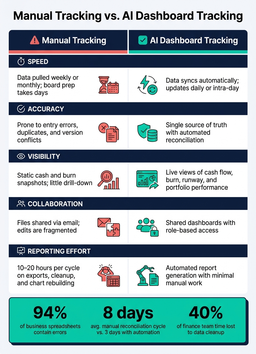
Manual Tracking vs. AI Dashboard: Key Differences for Startup Finance Teams
For startup finance teams, portfolio tracking gets slow for a simple reason: the tracking work becomes the bottleneck.
The data is scattered across bank portals, payroll systems, cap table files, accounting software, and spreadsheets. So instead of reviewing the numbers, teams spend their time chasing them down, cleaning them up, and trying to make them match.
Disconnected data leads to stale and conflicting reports
When data lives in separate systems and each one updates on its own schedule, the numbers stop lining up.
A bank export from last Friday might show $1,250,000 in cash. The CFO's spreadsheet, updated Monday after a wire went out, shows $1,180,000. Then the board deck pulls from the stale file and presents the wrong runway.
Version control makes the mess worse. Files named "Financials_v7_FINAL.xlsx" get emailed around, edited on different laptops, and shared again with no sync. At that point, nobody is fully sure which file is the right one.
And this isn't a small issue. 94% of business spreadsheets used for decision-making contain errors. For a lean finance team, that eats up a huge chunk of time and attention.
Infrequent updates make it harder to catch risk early
Weekly or monthly updates create blind spots.
A software contract can hit. Hiring can ramp faster than planned. Burn can jump right away. But with manual tracking, that change may stay hidden until the next reporting cycle. By then, the team is still talking about burn and runway using old numbers.
Aberdeen Group research found that manual reconciliation averages 8 days per cycle, versus 3 days with automation. That's a big gap when investors want current data on burn, runway, and portfolio performance - not a snapshot from two weeks ago.
Manual tracking vs. AI dashboard tracking
Here's the plain difference between the two approaches:
| Aspect | Manual Tracking | AI Dashboard Tracking |
|---|---|---|
| Speed | Data pulled weekly or monthly; board prep takes days | Data syncs automatically; views update daily or intra-day |
| Accuracy | Prone to entry errors, duplicates, and version conflicts | Single source of truth with automated reconciliation |
| Visibility | Static cash and burn snapshots; little drill-down | Live views of cash flow, burn, runway, and portfolio performance |
| Collaboration | Files shared via email; edits are fragmented | Shared dashboards with role-based access |
| Reporting Effort | 10–20 hours per cycle on exports, cleanup, and chart rebuilding | Automated report generation with minimal manual work |
AI dashboards fix the core problem by pulling live data into one place and handling updates automatically.
How AI dashboards simplify the tracking workflow
AI dashboards replace manual data chasing with automatic, live updates. Once data sits in one place, the next win is speed: routine tracking gets handled for you.
Centralized data turns multiple sources into one live view
An AI dashboard connects to accounting software, bank feeds, payroll providers, and billing tools. Each time a transaction posts or a journal entry gets recorded, the dashboard picks it up and updates the numbers on its own. The result is one current view of cash, burn, runway, and plan variance, without anyone downloading a CSV.
That matters because spreadsheet-based finance work can eat up a lot of time before analysis even starts. Finance teams that rely on spreadsheets often spend around 40% of their time cleaning and consolidating data before they can do any real analysis. Centralized dashboards remove most of that prep work.
Once the dashboard brings everything in, AI takes over much of the repetitive sorting and matching.
Automated categorization and reconciliation cut repetitive work
AI categorization learns recurring vendors and maps them to the right category. Over time, it gets better with fewer manual fixes. On the reconciliation side, the AI matches bank transactions to general ledger entries, flags mismatches, and shows only the exceptions that need a person to step in.
That keeps portfolio reporting current and cuts down on cleanup before review. It also lowers the chance of errors and reduces reliance on formula-heavy spreadsheets.
That cleaner data sets up one more time-saver: asking direct questions and getting direct answers.
Natural-language queries help founders get answers fast
Most founders don't want to build a report. They just want the answer. Natural-language query features let you type a question like How has our net burn changed over the last three months? and get an instant chart or summary pulled from live data. No formulas. No pivot tables. No waiting.
Lucid Financials pushes this a step further by putting financial visibility right inside Slack. A founder can ask in a Slack channel, What's our current cash balance and runway? or How did actual spending last month compare to our budget? and Lucid's AI returns investor-ready numbers and summaries on the spot.
For lean startup teams, that's a big deal. It means getting answers in seconds without switching tools or building ad hoc spreadsheets.
The dashboard views that matter most for startup decisions
Once your data lives in one place, the next job is picking the views that should guide actual decisions.
Portfolio value, performance trends, and cash flow in one place
Start with a single view of portfolio value by entity and account. Then watch both the short-term and the longer arc: short-term swings can help you spot odd movements, while 3- to 12-month trends show what’s happening with growth, margin, burn, and drift from plan.
Cash flow is right in the middle of all of this. You need a plain view of inflows, like customer payments, tax credits, and investor capital calls, next to outflows such as payroll and vendor payments. That gives you a live picture of net cash and runway in months.
A good dashboard cuts out the clutter. An AI dashboard should use rolling averages and thresholds to flag changes only when they move past normal volatility. It should also explain that context in plain language, so you don’t make a big call, like cutting headcount, over a short-lived fluctuation.
Concentration, diversification, and variance from plan
After the top-line view, go one layer deeper into exposure and gaps against plan.
Total value matters, but concentration tells you where the risk sits. A good dashboard shows revenue concentration by customer, for example by flagging when one account goes above 25% of ARR. It should also show cash concentration across banks and expense concentration by vendor or department.
Put that next to a plan-vs.-actual view for revenue, gross margin, opex, burn, and runway. Dollar deltas and percentage variance make it easier to see where you’re off track and what may be driving it. If the plan showed 14 months of runway but actuals now show 11, that’s a clear sign to revisit hiring timing or move up your next raise. Lucid Financials can feed these views with clean, real-time numbers.
Alerts and risk signals that support faster action
Alerts need to be specific enough to act on. That means flagging cloud-cost spikes, cash shortfall risk, budget breaches, and churn risk early, while there’s still time to respond.
AI-driven risk signals add another layer by pairing pattern detection with business context. Say a churn risk score pulls from usage declines, payment behavior, and support activity. It may flag that three mid-size customers, representing 12% of ARR, need outreach this week, long before the problem shows up in your revenue line. That changes the board conversation. Instead of walking through what went wrong, the team can show how it’s handling risk before it spreads.
To avoid alert fatigue, keep the first set of triggers tight and high impact. Good starting points include:
- Runway threshold breaches
- Revenue run-rate deviations above 10%
- Budget overruns by category
That last one matters more than it may seem. If teams can see overruns by category early, they can adjust hiring, spend, or raise timing before overspend spills into other parts of the business.
These alerts work best when they show up in channels the team already uses, like Slack and email, and when they include plain context on whether a spike is a one-time event or part of a longer trend. That extra lead time can make the difference between fixing an issue early and explaining it later to investors.
These same views also keep board and fundraising prep current.
Why real-time dashboards improve investor readiness
Those alerts matter most when they also feed board and fundraising prep.
Current numbers make board and fundraising prep more credible
With live data in place, board questions can turn into instant answers. If a board member asks how runway changes if you add more account executives next quarter, you can pull up a live scenario view on the spot instead of saying you'll circle back later.
That carries even more weight during fundraising. Prospective investors tend to ask for the same core metrics already sitting in your dashboard: MRR, net burn, gross margin, and actuals vs. plan. When those views stay connected to your accounting system, board decks can come together in hours instead of days, and diligence prep shifts from weeks of file assembly to less file assembly.
Startups that keep a clean, live reporting stack in place before fundraising begins are in a stronger spot to move fast when investor interest shows up. Lucid Financials supports this workflow with Slack-based answers and always-current investor reporting.
Conclusion: AI dashboards cut reporting effort and improve visibility
Less manual reporting, clearer investor conversations, and a shared live view of performance - that's the practical result of replacing spreadsheet-based tracking with an AI dashboard.
FAQs
What data sources should an AI dashboard connect to?
To build a single source of truth, an AI dashboard needs direct API integrations with both operating and finance systems.
That usually means pulling data from accounting software, banking systems, payment processors, payroll providers, corporate card platforms, and tools like CRM, HRIS, and product analytics.
Lucid Financials pulls all of that into one place, then delivers real-time updates and AI-driven insights in Slack.
How long does it take to set up portfolio tracking?
AI-powered portfolio tracking starts with a five-minute setup. Once your data is organized and linked to live bank feeds, you can see real-time metrics right away.
Lucid Financials can also simplify operations by cleaning up your books in seven days. That cuts down the manual work that usually comes with old-school reporting.
Which alerts matter most for startup finance teams?
The most important alerts are the ones that protect your cash position and flag odd activity early. For startup finance teams, that usually means putting these alerts first:
- Spikes in burn rate
- Sudden dips in revenue
- Runway falling below a set threshold, such as six months
- Unusual expense spikes or signs of possible fraud
When these alerts are connected to Slack, teams get instant notifications and can act on risks or compliance gaps right away instead of waiting for month-end reports.