If I had to boil this down to one point, it’s this: a startup dashboard works when it shows only the numbers that drive decisions, updates each number at the right pace, and ties every metric back to a source people can verify.
I’d sum up the guide like this:
- Use two dashboards, not one: a founder dashboard for day-to-day calls and a board dashboard for high-level trend reporting.
- Update metrics based on decision speed: cash, billing, funnel, and product usage can update daily or intraday; closed finance numbers usually belong on a monthly cycle.
- Keep the main view tight: most teams only need 6–12 core metrics.
- Focus on metrics that change actions: cash balance, runway, burn, ARR/MRR, growth, margin, churn, NRR, pipeline, and headcount.
- Build a simple data flow: ingest, transform, reconcile, then publish.
- Set rules before launch: every metric needs an owner, a review cadence, and a trigger for what happens if the number moves the wrong way.
A few data points stand out. The article points to 12+ months of runway as a common floor, with 18+ months often preferred in a tight funding market. It also flags monthly MRR churn under 2% as a common target, with under 1% at the top end. And for efficiency, a burn multiple above 2.0x–3.0x is a sign to review spend.
What I like most is the article’s core filter: faster data is only useful when it changes a decision. That keeps teams from flooding a dashboard with half-checked finance data or charts no one uses. It also draws a clean line between numbers for daily action and numbers for board reporting.
The guide also makes a practical point about tooling. Early-stage startups often do better starting with direct SaaS connectors and adding a warehouse later, instead of building a heavy reporting setup too soon. From there, the work is less about fancy charts and more about clean books, clear metric definitions, plan-vs.-actual views, access control, timestamps, and monthly reconciliation.
In short, I’d say the article is not just about dashboards. It’s about building a reporting habit that people will use, check, and act on.
How to Build a KILLER Financial Dashboard (Free Template)
sbb-itb-17e8ec9
Choose the Right Dashboard Stack
Pick a dashboard stack that works for today's reporting needs and can still handle board-level reporting as the company grows.
Key Features to Look for in BI and Reporting Tools
Start with connectors. You want reliable, maintained connections to your accounting, bank, billing, CRM, and product analytics systems. In practice, maintained connectors matter more than raw flexibility. The best tool is usually the one that plugs into your main data sources without needing help from engineering.
Access control matters too. Look for role-based access controls so board members can get a clean, read-only summary, while founders and finance leads can dig into the details. Right alongside that, make sure the tool supports metric governance. ARR, burn rate, and CAC should mean the same thing in every report. If teams use different definitions, numbers start to drift, and investor trust can take a hit.
You should also check for plan-versus-actual reporting. At seed and Series A, investors usually want more than a snapshot of raw numbers. They want to see how performance lines up against the budget. A tool that can import a budget model and match it to actuals from the accounting system can save a lot of tedious reconciliation work.
Tool Capabilities by Startup Use Case: Comparison Table
Use case should drive the decision. Match the tool to the job at hand, whether that's financial reporting, sales pipeline tracking, product analytics, or executive scorecards.
| Use Case | Refresh Cadence | Warehouse Connectivity | Access Controls | Implementation Complexity |
|---|---|---|---|---|
| Financial reporting | Daily, aligned with accounting close | Direct SaaS or warehouse | Finance and board views separated | Low to medium |
| Sales pipeline tracking | Near real-time | CRM-native or warehouse | Sales team + exec summary | Low (CRM-native tools) |
| Product analytics | Real-time to hourly | Event-based tools (Mixpanel, Amplitude) | Product team + exec rollup | Medium |
| Executive scorecards | Daily to weekly | Warehouse (Snowflake, BigQuery) | Full RBAC across functions | Medium to high |
There’s a tradeoff here. Tools with strong warehouse connectivity give you more room to combine data across teams, but they usually take more time to set up. Direct SaaS connectors are faster to get live, though they may limit cross-system joins. For most startups before Series B, it makes more sense to start with direct connectors and add a warehouse layer later.
Where Lucid Financials Fits in the Reporting Stack
Lucid Financials sits underneath the stack as the financial layer. It combines bookkeeping, tax, and CFO support, and delivers clean books in seven days. Its direct Slack integration lets founders ask financial questions and get answers in real time. Its AI-assisted forecasts can help show forward-looking views of revenue, expenses, and cash runway inside dashboards. And its board-ready reports in U.S. formats give investors the consistency they expect.
With the stack in place, the next step is deciding which essential financial metrics belong on the dashboard.
Decide What to Show on the Dashboard
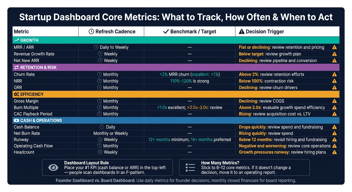
Startup Dashboard Metrics: What to Track, How Often & When to Act
Once your stack is set up, trim the dashboard down to the few numbers that actually change decisions.
The biggest mistake is stuffing it with too much. A good dashboard usually sticks to 6–12 core metrics tied directly to choices like hiring, spend, pricing, fundraising, or retention. If a metric doesn’t change one of those calls, it should sit in a deeper operating report, not on the main dashboard.
Core Metrics for Founders, Finance Leads, and Investors
A simple way to make the dashboard easy to scan is to group metrics into four buckets: growth, retention and risk, efficiency, and cash and operations.
Growth includes MRR or ARR, revenue growth rate, and net new ARR. Retention and risk include churn, NRR, and GRR. Efficiency covers gross margin, burn multiple, and CAC payback period. Cash and operations include cash balance (USD), net burn rate, runway in months, operating cash flow, and headcount.
Benchmarks help, but they shouldn’t become the whole story. Think of them as warning lights.
- Burn multiple below 1.0x is excellent. Above 2.0x–3.0x means it’s time to take a hard look.
- NRR of 110%–120% is strong.
- Monthly MRR churn below 2% is a common benchmark, and below 1% is excellent.
- Investors usually want 12+ months of runway, with 18+ months preferred when fundraising is uncertain.
Layout Rules That Make Dashboards Easier to Use
Put the single most important KPI - often cash balance or ARR - in the top-left position. Eye-tracking research shows that people scan dashboards in an F-pattern, starting at the top-left. That’s why your highest-priority number belongs there.
A practical layout is a top row with 4–6 KPI summary cards, followed by 6–12 months of trend lines underneath. Next to each metric, show plan and prior-period comparisons. That way, someone can tell at a glance if performance is improving, slipping, or tracking to budget.
Use line charts for trends like revenue, cash, and churn over time. Use bar charts for comparisons like spend by department or revenue by segment. And always show a clear timestamp on the dashboard, such as "Updated 9/9/2026 at 3:30 PM ET", so viewers know how current the data is.
Metric Table: Definition, Data Source, Update Cadence, and Decision Trigger
| Metric | Definition | Source System | Refresh Cadence | Decision Trigger |
|---|---|---|---|---|
| Cash Balance | Unrestricted cash (USD) | Bank / accounting system | Daily | If cash drops quickly, review spend and fundraising timing |
| Runway | Months of cash remaining at current net burn | Accounting / FP&A | Weekly | Below 12 months: revisit hiring plans and fundraising timeline |
| Net Burn Rate | Monthly cash outflows minus inflows | Accounting system | Monthly or weekly | If burn rises quickly, review spend |
| Burn Multiple | Net burn ÷ net new ARR | Accounting + CRM | Monthly | Above 2.0x: evaluate efficiency of growth spend |
| MRR / ARR | Monthly or annualized recurring revenue | Billing / CRM | Daily to weekly | Flat or declining: review retention and pricing |
| Revenue Growth Rate | % change in MRR or ARR vs. prior period | Billing / CRM | Weekly | Below target: review the growth plan |
| Gross Margin | (Revenue − COGS) ÷ Revenue | Accounting system | Monthly | Declining margin: review COGS |
| Churn Rate | % of MRR or customers lost in a period | Billing / CRM | Monthly | Above 2% monthly MRR churn: review retention efforts |
| NRR | Net revenue retained from existing customers, including expansion | Billing / CRM | Monthly | Below 100%: signals contraction risk |
| Operating Cash Flow | Cash generated or used by core operations | Accounting system | Monthly | Negative and worsening: review core operations |
| Headcount | Total full-time employees | HRIS | Weekly | If headcount growth pressures runway, review hiring plans |
Every metric needs two things before it earns a place on the dashboard: a source system and a refresh cadence.
With the right set of metrics in place, the next move is to map each one to its source system and update schedule.
Build the Data Pipeline and Reporting Process
Before a metric shows up on a dashboard, it needs a clear path. Map each metric to its source system, refresh cadence, and reconciliation step. In plain terms: know where the number comes from, how often it can update, and how you'll check it before people act on it.
That starts with matching each metric to the system that owns it and the update pace that system can support.
Map Source Systems to Business Questions
Tie each system to the decision it helps you make:
- Accounting system: How much runway do we have, and what are we spending by category versus budget?
- Bank accounts: What is our cash balance across all accounts?
- Billing system (e.g., Stripe, Chargebee): What is our MRR or ARR, and how is it changing?
- CRM (e.g., Salesforce, HubSpot): Do we have enough pipeline for the next two quarters, and where are deals stalling?
- Product analytics (e.g., Mixpanel, Amplitude): Are new users activating in their first seven days, and which features drive retention or churn?
A simple four-step flow works well here: ingest, transform, reconcile, publish. That reconciliation step matters more than most teams think. Skip it, and the dashboard can look up to date while still failing to match the books.
Once your sources are mapped, set refresh rules for each metric type.
Set the Right Refresh Cadence for Each Metric
Refresh data at the speed it can support.
Cash and billing data can update intraday or daily. Sales and operations data usually fits a daily to weekly schedule. Closed financials should stay monthly.
Financial metrics should only refresh as fast as data quality allows. Mark metrics as preliminary or closed, and show a clear timestamp so people can see how current the data is.
Use Lucid Financials for Clean Books and Investor-Ready Reporting
Clean, reconciled books are what make downstream dashboard metrics like burn rate, runway, and gross margin dependable. Lucid Financials handles bookkeeping, reconciliation, and investor-ready reporting, so the financial layer of your dashboard stays tied to accurate, closed data instead of estimates.
Next, assign owners and review cycles so the dashboard stays accurate.
Governance, Accuracy, and the Final Dashboard Checklist
A dashboard is only as trustworthy as the rules behind it. Source mapping and refresh rules get the system running. Governance keeps it from drifting once people start using it.
At the simplest level, governance answers a few plain questions: Who owns each metric? When does someone review it? What happens if the number moves in the wrong direction? If those answers are fuzzy, the dashboard won't hold up for operators, founders, or the board.
Assign Owners and Review Schedules
Every metric on your dashboard needs a named owner, not just a department. A team can share the work, but one person should be on the hook for the definition, the data quality checks, and the path for escalation when something looks off.
Finance owns cash runway and net burn. Revenue Operations owns pipeline metrics. Product or Growth owns activation and retention.
Review timing should match how fast the metric changes and how much it affects the business. Activation rate, for example, can shift fast, so a weekly review usually makes sense. Burn and runway move on a slower cycle, so monthly review is a better fit, usually by the 10th after month-end close.
Governance Table: Metric Owner, Review Cycle, and Reconciliation Notes
Use the table below to assign accountability before the dashboard goes live.
| Metric | Owner | Review Cadence | Reconciliation Method | Board/Investor Notes |
|---|---|---|---|---|
| Cash Runway (months) | Head of Finance / Lucid Financials | Monthly, by the 10th after close | Reconciled to bank accounts in USD and general ledger | Label with an As of date; align assumptions with hiring and renewals |
| Net Monthly Burn (USD) | Finance | Monthly | Total cash outflows minus inflows; reconciled to P&L and cash flow statement | Exclude one-time financing events; show a 3–6 month trend |
| Qualified Pipeline (USD) | Revenue Operations | Weekly | CRM opportunities in defined stages at or above agreed probability threshold; reconciled against closed-won data monthly | Report as of a specific date; note stage-definition changes |
| Activation Rate (%) | Product / Growth | Weekly | Event tracking via analytics tool; spot-checked against raw logs when event schema changes | Note definition changes when onboarding or event tracking changes |
| ARR / MRR (USD) | Finance + Revenue Operations | Monthly | Billing system reconciled to CRM closed-won data | Clarify treatment of discounts and multi-year prepayments |
It also helps to attach one decision rule to each metric. This is where the dashboard stops being a passive report and starts doing real work.
For instance, if cash runway drops below 12 months, finance and the founders should review the hiring plan and fundraising timeline within two weeks. If activation rate falls by more than 5 percentage points week over week, Product should pause new tests and run a cohort analysis before moving ahead. That kind of rule keeps people from staring at a chart and doing nothing.
Conclusion: How to Launch a Useful Real-Time Dashboard
The best startup dashboard is the one people trust and actually use. That usually starts with a clear audience - founders, finance leads, or the board - and a tight set of metrics tied to real decisions.
Each metric should point to a source system people trust. Each refresh schedule should match how the data changes in real life. And governance should be in place before the dashboard goes live, not after something breaks.
For founders, that keeps operating metrics useful day to day. For boards, it makes reporting easier to defend. Lucid Financials can support the financial layer with bookkeeping, reconciliation, and investor-ready reporting, so burn, runway, and gross margin metrics stay accurate as your company grows.
FAQs
What should go on a startup dashboard first?
Start with your core business goals. Then pick the five to seven KPIs that best show whether you're moving in the right direction.
Put cash flow, burn rate, and runway first. Those three give you a plain view of your financial health.
Place these metrics at the top of your dashboard so they’re the first thing you see. Then automate data collection from your accounting and banking tools to keep updates accurate and in real time.
How often should dashboard metrics update?
Dashboard metrics should update as often as new data comes in so teams can make timely, informed decisions. Real-time doesn’t always mean second-by-second. It means the data is current enough to act on.
Some metrics need more frequent updates than others. Cash and treasury positions may call for daily updates, while operating expenses might make more sense on a weekly cadence.
Automated refreshes through integrations help keep metrics accurate and investor-ready. They also cut delays and reduce manual errors.
When do startups need a data warehouse?
Startups tend to look at a data warehouse once growth starts to strain basic reporting. At that point, they often need highly customized visualizations built on top of structured data.
That shift usually happens when the team needs deeper analysis, reporting across multiple entities, or complex financial modeling that goes beyond what standard out-of-the-box reporting tools can handle.