Want to make your investor reports stand out? Infographics are the key. They simplify complex financial data, making it easier for investors to understand key metrics like revenue, growth, and risk. This guide covers how to create clear, professional visuals that build trust and engagement.
Key Takeaways:
- Why visuals matter: People absorb only 20% of text but process visuals much faster. A simple chart can convey trends like 18% MRR growth more effectively than paragraphs of text.
- What investors care about: Focus on growth, efficiency, and risk. Use the right chart types (e.g., line charts for trends, waterfall charts for revenue breakdowns).
- Data accuracy is critical: Reconcile your books and validate data before creating visuals. Tools like Lucid Financials can help streamline this process.
- Design tips: Keep visuals simple, use consistent formatting, and highlight key takeaways. Avoid cramming too much data into a single chart.
- Structure your report: Start with an executive summary, include a metrics dashboard, and use clear, action-oriented headlines like "Revenue grew 4x in the last 12 months."
By following these steps, you can create investor reports that are clear, engaging, and professional. Clean data and thoughtful design make all the difference.
How to Create Stunning Infographics for Your Business Reports
Core Principles of Effective Financial Infographics
Turning complex financial data into clear, digestible visuals is key for investor reporting. The foundation lies in accurate data, but design principles that align with investor priorities take it to the next level.
Keep Visuals Simple and Clear
Every chart should answer one specific question, like tracking MRR trends or estimating runway length. A good test? Show the chart to someone unfamiliar with it and see if they can grasp the main point in just five seconds.
Avoid unnecessary elements like decorative icons, heavy gridlines, or 3D effects. Edward Tufte’s principle applies here: most chart elements should serve the data, not decoration. Stick to one or two accent colors, use a clean sans-serif font, and leave enough white space for easy readability.
Once simplicity is in place, the next step is tailoring visuals to align with what matters most to investors.
Align Visuals with What Investors Care About
Investors typically focus on three areas: growth, efficiency, and risk. Your infographics should directly address these priorities.
For U.S.-based investors, key metrics often include MRR/ARR, gross margin, CAC, LTV, monthly burn rate, and cash runway. Choosing the right chart type for each metric is just as important. For instance:
- Use line charts to show MRR trends over time.
- Combination charts work well for illustrating risk - bars for net burn and a line for cash balance.
- Cohort heatmaps or retention curves are ideal for demonstrating churn and net revenue retention.
By matching the chart type to the specific metric, you signal to investors that you understand their analytical approach. Also, ensure dollar amounts are formatted in standard U.S. style (e.g., $1,250,000 or $1.25M) and use familiar date formats like "Jan 2026" or "Q1 2026."
Start with Accurate, Reconciled Data
Even the best design can’t fix inaccurate data - mistakes will undermine investor trust.
Before creating visuals, ensure your data is fully reconciled. This means closing your books, reconciling bank accounts, payment processors, and revenue sources, and locking the dataset for the reporting period. Every chart should be based on a single, well-documented data source. A brief internal checklist - verifying that figures match your latest close, units are consistent, and visuals align with financial statements - can catch errors before they reach investors.
Lucid Financials simplifies this process. Their AI-driven platform integrates bookkeeping, CFO services, and real-time reporting, connecting directly to accounting systems, bank feeds, and revenue platforms. By automatically reconciling data and flagging issues like mismatched invoices or unexpected expense spikes, it ensures your numbers are solid. Since bookkeeping, tax, and CFO oversight are all handled within the same system, your visuals are backed by consistent, validated data - not scattered spreadsheets. Founders can even use Slack to ask questions like, "What’s our latest burn multiple?" or "Show MRR by segment for the last 12 months", and receive answers tied directly to reconciled books - ready for investor presentations.
With these principles in place, you’re ready to move on to designing practical, investor-focused reports.
How to Design Investor Reports with Infographics
Matching Metrics to the Right Chart Types
Choosing the right chart type is crucial for helping investors quickly grasp your data. A poorly chosen chart can slow down understanding, while the right one makes your insights crystal clear.
After ensuring your data is accurate and reconciled, pair each metric with the chart type that best conveys its meaning:
| Metric Category | Best Chart Type | Key Data |
|---|---|---|
| Growth | Time-series line or bar chart | MRR, ARR, MoM, and YoY growth % |
| Revenue Quality | Waterfall chart | New MRR, Expansion, Churn, Contraction |
| Retention | Cohort analysis chart | NRR, Gross Revenue Retention |
| Efficiency | Ratio table or gauge | LTV:CAC, CAC Payback Period, Burn Multiple |
| Financial Health | Runway table or gauge | Cash balance, monthly burn, months of runway |
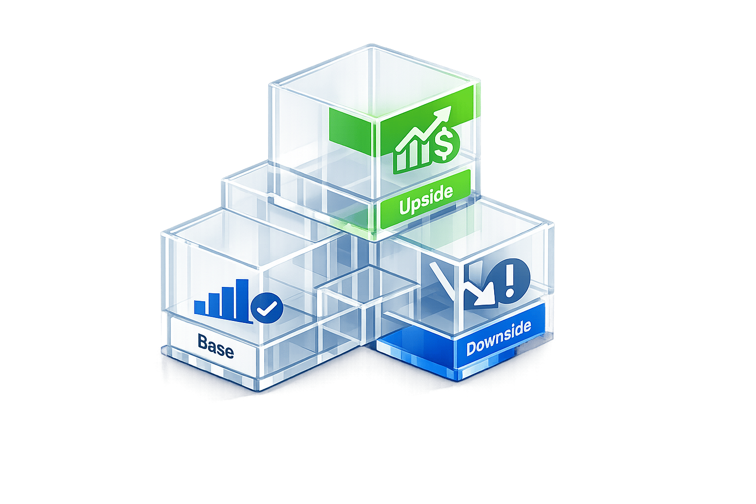
| Forecasting | Scenario table | Base, Upside, and Downside cases |
This alignment keeps the focus on growth, revenue quality, and efficiency - key areas investors care about most.
For example, waterfall charts are perfect for breaking down MRR changes by showing new revenue, expansion, churn, and contraction. This transparency gives investors a clear picture of what’s driving your business, rather than just presenting the net result.
"Gross revenue retention is arguably the most important metric for a scaling enterprise software company right now." - Kyle Poyar, Founder, Tremont
By selecting the right charts, you can guide investors seamlessly from high-level metrics to detailed insights.
Structuring Your Report for Maximum Clarity
Investors often take a quick first pass through reports, spending an average of just 2 minutes and 24 seconds. During this time, they focus 60–70% of their attention on the metrics dashboard. To make the most of this brief window, structure your report in a way that mirrors their reading habits.
Start with a concise executive summary that highlights key wins, challenges, cash balance, and runway. Follow this with a metrics dashboard, then move into simplified financial statements (P&L, balance sheet, and cash flow). Wrap up with variance analysis and forward-looking projections.
One pro tip: use takeaway headlines instead of generic labels. For example, a slide titled "Revenue grew 4x in the last 12 months" immediately communicates the key point. Compare that to a slide labeled "Traction", which forces investors to dig for the insight themselves. The first approach respects their time and keeps them engaged.
Maintaining Visual Consistency and Brand Alignment
Consistency in your report’s design reflects professionalism and attention to detail. Use the same chart styles, metric definitions, and formatting across all reports, and clearly flag any changes.
"Consistency across slides matters more than any single design choice: the same typeface, color palette, and chart style throughout the deck signal professionalism without requiring a designer." - Visible.vc
Stick to a simple two-color accent palette, a clean sans-serif font, and a minimum font size of 24 points to ensure readability on any device. Use color strategically - highlight the one data point in each chart that you want investors to focus on, rather than overloading the chart with multiple colors.
Finally, deliver your report as a single, well-named PDF file, such as CompanyName_Board-Report_2026-05.pdf. This small detail shows operational discipline and leaves a strong impression.
"The way you share your report says a lot about your business. It actually reflects how you run your business. If it looks messy or confusing, your message gets lost." - Steven Plappert, CEO, Forecastr
sbb-itb-17e8ec9
Common Infographic Mistakes to Avoid
Creating effective investor reports requires more than just good design; it’s about avoiding missteps that can weaken your message. Poorly executed visuals can damage credibility, but the good news is that many mistakes are easy to identify and correct once you know what to watch for.
Cramming Too Much Data into One Chart
A common error is overloading a single chart with too much information. Imagine a line chart attempting to track 15 different metrics simultaneously - it’s more likely to confuse than clarify. Research shows that well-designed charts can improve understanding by 80% compared to raw tables. However, this benefit only works when each chart focuses on a single, clear idea.
The solution? Break the data into multiple, simpler charts. Each one should address a specific question, making it easier to compare information and spotlight key trends.
"If you find yourself including a chart because you have the data rather than because it supports an argument, cut it." - WOLF Financial Team
To make charts even more effective, use action titles. These are headlines that state the key insight rather than just describing the topic. For example, instead of "Quarterly Revenue", say, "Revenue Grew 15% Quarter-Over-Quarter." This approach immediately communicates the takeaway. Now, let’s tackle another frequent issue: scaling and formatting errors.
Using Misleading Scales or Inconsistent Formatting
Misleading scales can quickly erode trust. For instance, truncating the Y-axis on a bar chart might exaggerate a small 2% difference, making it appear like a 200% jump. Not only is this a design flaw, but it also poses compliance risks.
"A chart that is technically accurate but visually misleading through truncated scales, selective time ranges, or cherry-picked data still creates regulatory risk." - WOLF Financial Team
To avoid this, always start bar chart Y-axes at zero. For line charts, where scale matters, clearly label the range and include annotations if needed. Consistency in formatting is equally important. Switching fonts, colors, or chart styles mid-report can make the document feel disjointed and unprofessional. A simple one-page style guide that outlines approved fonts, colors, and formatting rules can help maintain a polished look.
Also, keep accessibility in mind. About 8% of males experience some form of color vision deficiency, so don’t rely solely on red/green color coding. Use high-contrast colors paired with distinct shapes or patterns to ensure readability for everyone.
Before you finalize your report, use a checklist to catch these issues.
A Pre-Submission Checklist for Infographics
Here’s a quick checklist to ensure your visuals are clear, accurate, and professional before sending out your report:
| Check | What to Verify |
|---|---|
| Y-axis integrity | Bar charts start at zero; scales are clearly labeled. |
| Action titles | Every chart has a headline that highlights the main insight. |
| Color accessibility | Charts are readable in grayscale; avoid red/green-only coding. |
| Data sourcing | Sources and report dates are included on every chart. |
| Font consistency | Use the same sans-serif font throughout the report. |
| Mobile readability | Ensure visuals are legible at 375px width (41% of email opens are on mobile). |
| Figures reconciled | Double-check that all numbers match the source data or ledger. |
| Narrative context | Provide brief explanations for any significant variances. |
"Standardized fonts, tables, dates, and naming conventions make your reports easier to review and more credible overall." - Pigment
A thorough review process not only catches errors but also reinforces the professionalism and precision that make your visuals stand out. When every detail aligns, your report becomes a tool that builds confidence and trust.
Building a Repeatable Infographic Reporting Workflow
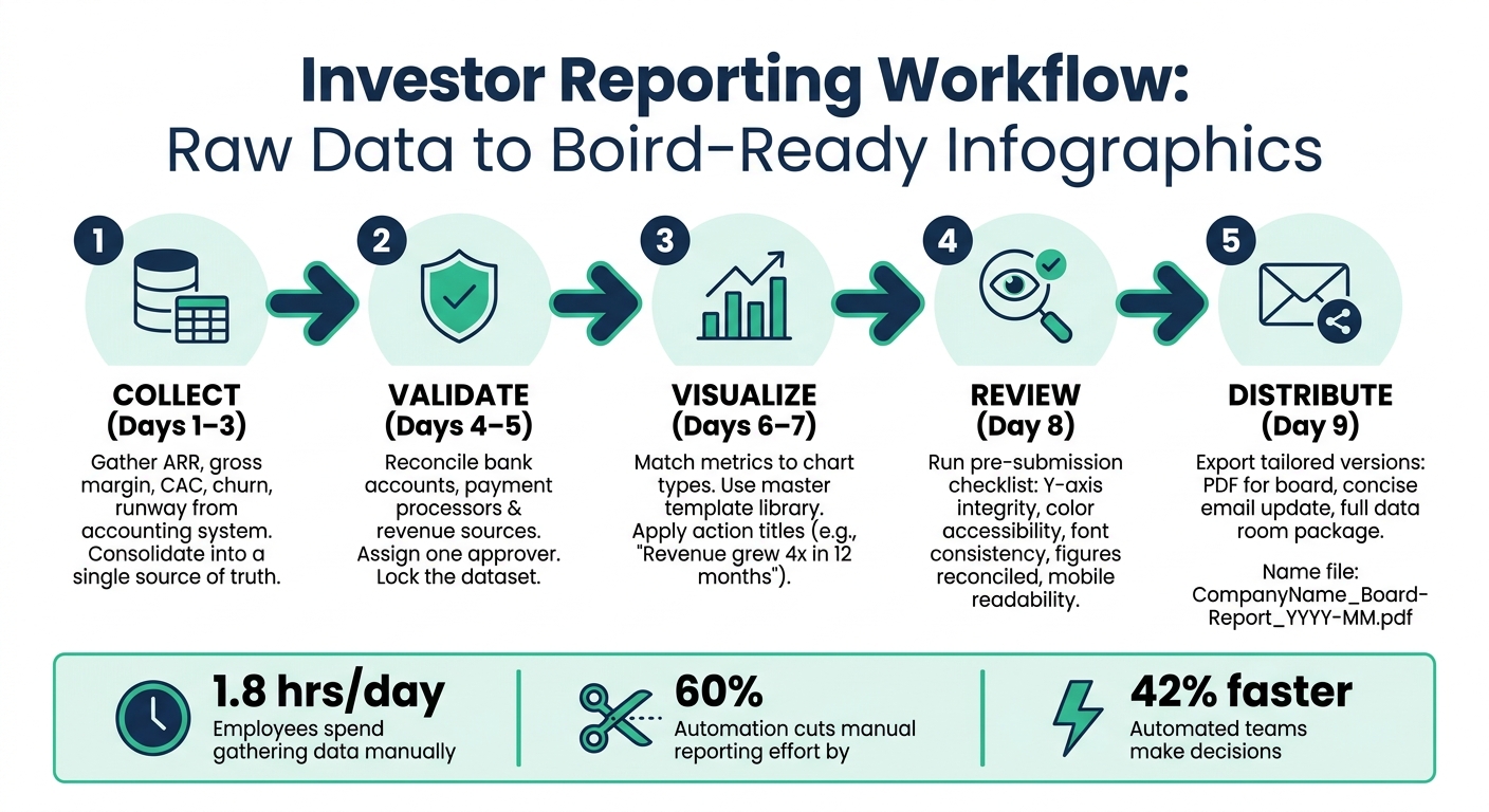
Investor Reporting Workflow: From Raw Data to Board-Ready Infographics
A structured workflow is key to turning raw data into polished investor infographics. Once you've addressed any visual errors, the next step is creating a process that ensures your investor reports are both consistent and professional.
From Raw Data to Investor-Ready Infographics
A dependable workflow follows five main steps: collect, validate, visualize, review, and distribute. Begin by gathering financial data from your accounting system, along with critical KPIs like ARR, gross margin, CAC, churn, and runway. Consolidate all of this into a central source of truth. Before diving into the design phase, reconcile all numbers and establish a firm cutoff point. Assign a single person to approve the data to avoid any last-minute changes. This clear division between data preparation and design ensures updates are accurate and quick.
Document your process with clear roles and timelines. For instance:
- Close the books on Days 1–3
- Calculate and validate KPIs on Days 4–5
- Refresh visuals on Days 6–7
- Reserve Day 8 for leadership review
- Distribute the final report on Day 9
Using a master template library can also help maintain consistency across visuals, such as MRR growth, burn versus runway, and cohort retention charts.
Automation can take this workflow to the next level, saving both time and effort.
Using AI and Automation to Save Time
Manual reporting through spreadsheets is a time sink - research shows employees spend an average of 1.8 hours daily just gathering data. Automating data collection and chart updates can eliminate much of this inefficiency.
AI-powered tools can pull accounting and operational data on a set schedule, flag anomalies, and generate a draft investor update in minutes rather than hours. These tools aim to deliver a solid first draft that your team can review and refine. For example, Lucid Financials integrates bookkeeping, tax, and CFO support into one platform. According to BARC research, businesses using automated reporting cut manual effort by 60% and made decisions 42% faster compared to those relying on spreadsheets.
Once automation is in place, you can focus on tailoring your visuals for different channels.
Tailoring Infographics for Different Formats and Channels
Your core data can be adapted for various delivery formats. For presentations, focus on storytelling with simple, impactful visuals. Email updates should be concise, clear, and easy to understand on mobile devices. Data rooms, on the other hand, require more comprehensive materials, complete with source notes, metric definitions, and version histories.
For live board meetings, use large, straightforward visuals that complement your verbal explanations. When preparing materials for emails, ensure the key takeaway is immediately clear. For data rooms, provide the depth and context investors need to cross-reference details during due diligence. Create one master report for each reporting period, then export tailored versions for different channels to maintain consistency and avoid conflicting numbers.
Conclusion: Best Practices for Investor Reporting with Infographics
Investor infographics are a powerful way to deliver information quickly and effectively. The best reports combine precise data, clear visuals, and a well-structured narrative - key ingredients for creating a strong reporting strategy.
Key Takeaways
Every investor update should follow a simple flow: Data → Visuals → Story. Start by ensuring that critical figures - like cash, runway, ARR, burn rate, gross margin, CAC, and net retention - align with your general ledger. Each chart should answer a specific investor question, use consistent scales, follow U.S. number formatting, and include a short takeaway. Your narrative should highlight your current position, key trends, drivers, and where you're headed next.
Avoid common mistakes that can damage trust: cherry-picking data, redefining metrics without explanation, or tweaking chart scales to mislead. Consistency in how you present metrics, definitions, and formatting is critical to maintaining investor confidence over time.
How Lucid Financials Can Help
Struggling to get clean, reliable numbers? Lucid Financials can simplify the process. With reconciled, GAAP-aligned books ready in about seven days, real-time updates via Slack, and one-click, board-ready reports, Lucid ensures your data is accurate and your story is always ready to share. This foundation makes it easy to create infographics that investors can trust.
Take Action
Set aside an hour this week to review your reporting process. Double-check your numbers, select clear visuals, and refine your narrative. If you need a dependable financial system to back this effort, consider using Lucid Financials to automate bookkeeping and create investor-ready reports effortlessly.
FAQs
Which metrics should I visualize for investors first?
When presenting your business to investors, certain metrics can paint a clear picture of where you stand financially and how you're positioned for growth. These include:
- Revenue Growth: Metrics like Monthly Recurring Revenue (MRR) or Annual Recurring Revenue (ARR) showcase how your revenue is trending over time.
- Burn Rate: This reflects how quickly you're spending cash, giving insight into operational efficiency.
- Cash Runway: Investors want to know how long your current cash reserves will last at your current burn rate.
- Customer Acquisition Efficiency: Key metrics here include Customer Acquisition Cost (CAC), Lifetime Value (LTV), and the LTV:CAC ratio. These numbers reveal how cost-effective your customer acquisition strategies are and the long-term value those customers bring.
Together, these metrics help investors gauge your financial health, growth trajectory, and overall sustainability.
How can I ensure my charts are accurate and not misleading?
Creating accurate and trustworthy charts requires clarity and consistency. Here are some key practices to keep in mind:
- Start axes at zero: This ensures data is represented fairly and avoids exaggerating differences between values.
- Match visuals to data: Make sure elements like bar heights or line lengths accurately reflect the data points they represent.
- Use clear labels: Properly label axes and data points to eliminate guesswork and confusion for your audience.
- Watch for common pitfalls: Avoid mistakes like reversed axes, distorted proportions, or inconsistent scaling, as these can mislead viewers.
- Validate your visuals: Regularly review your charts to ensure they align with the data, helping to build trust and communicate your message effectively.
By following these steps, your charts can deliver accurate insights and maintain credibility.
What’s the easiest workflow to produce a board-ready report every month?
Creating a board-ready report each month doesn't have to be a hassle. By automating tasks and sticking to a straightforward process, you can streamline the entire workflow. Here's how: set a clear schedule, automate data collection using tools like Lucid Financials, and present the information visually with charts and key metrics. Once that's done, review everything for accuracy and distribute the report consistently, aiming for 5–7 days after the month ends. This approach not only saves time but also ensures polished, professional results every time.