Visual storytelling simplifies complex financial data, making it easier for investors to quickly grasp key insights. Traditional text-heavy reports often overwhelm readers with dense information, reducing engagement and retention. By using tools like charts, infographics, and timelines, you can present financial performance, growth trends, and strategic goals in a way that's clear, engaging, and memorable.
Key Takeaways:
- Visuals are processed 60,000x faster than text and improve information retention.
- Replace dense spreadsheets with line charts, bar graphs, and summary tables for clarity.
- Use timelines and milestone roadmaps to highlight achievements and future goals.
- Consistent branding and professional design build trust and credibility with investors.
- Tools like Lucid Financials automate report creation, ensuring accuracy and real-time updates.
Visual storytelling isn't just about aesthetics - it's about creating reports that communicate your company’s growth and potential effectively, helping you build stronger investor relationships.
11 Finance Charts & Graphs to TRANSFORM your Presentations
Key Methods for Visual Storytelling in Investor Reports
Turning dense financial data into an engaging visual story takes a thoughtful mix of clarity and creativity. The best strategies combine smart data visualization techniques with storytelling tools that highlight your startup's journey and future potential.
Data Visualization Best Practices
Line charts are ideal for showcasing revenue growth because they make trends over time easy to follow. For metrics like MRR or annual revenue growth, use a line chart with evenly spaced time intervals on the x-axis and clearly labeled dollar amounts on the y-axis. This helps investors quickly identify patterns, whether it's steady growth or sudden spikes.
Bar graphs are perfect for comparing cash flow across time periods or categories. They work well for showing quarterly performance or breaking down revenue by product line. To keep things clear, use proportional bars and consistent colors that distinguish different categories.
Infographics simplify runway and burn rate data by combining visuals with key numbers. Instead of overwhelming investors with a spreadsheet covering 18 months of cash flow projections, create a graphic that combines your current cash position, monthly burn rate, and projected runway into one clear snapshot.
When presenting to US investors, stick to these formatting guidelines:
- Use $1.2M for large numbers.
- Format dates as MM/DD/YYYY.
- Round percentage growth rates to one decimal place (e.g., 23.5%).
Every chart should include a descriptive caption that explains its relevance to your business. Keep each section of your report focused by limiting visuals to 3–4 key graphics. This ensures every element adds value without overwhelming the reader, and it avoids unnecessary decorative features that might distract from your message.
Once your visuals are in place, use storytelling frameworks to connect the dots between your past achievements and future plans.
Visual Frameworks for Your Growth Story
Timelines turn your company’s history into a story by showcasing major moments like funding rounds, product launches, or strategic shifts. A horizontal timeline with dates, short descriptions, and key metrics can make your journey easy to follow.
Milestone roadmaps give investors a clear view of your future goals. For example, you might highlight targets like "Launch enterprise product – projected $500K ARR by Q4 2026" or "Expand to European markets – targeting 25% international revenue by 2027." These visuals help investors understand your planned trajectory and the impact of upcoming achievements.
Before-and-after comparisons highlight the results of your strategies. For instance, you could show how user adoption or customer acquisition costs changed after implementing a new approach. Additionally, workflow diagrams can be useful for explaining how your product solves customer challenges - especially when the process is complex.
A common strategy for SaaS startups is to tie product milestones directly to financial outcomes. For instance, pair a timeline of feature releases with a bar chart showing monthly recurring revenue growth. This makes it clear how product development drives business performance.
Adding Branding and Custom Design
Consistent branding strengthens your company’s identity and makes your reports stand out. Use your brand’s color palette throughout the visuals, applying primary colors to highlight key data and neutral tones for supporting information.
Professional design boosts credibility with investors. Place your logo consistently - usually in the header or footer - and stick to 2–3 font families to maintain a cohesive look.
Custom illustrations tailored to your industry can make your report feel more specialized. For example, healthcare startups might use medical icons, while fintech companies could incorporate financial symbols. These details immediately signal your focus and attention to detail.
Color psychology matters in how investors perceive your data. Use green for positive metrics like revenue growth, red sparingly for issues needing attention, and blue for stable metrics like customer retention. A polished, well-designed report reflects your team’s execution capabilities, while inconsistent visuals can raise doubts about your attention to detail.
Carry this visual consistency across all investor communications - whether it’s quarterly updates, board presentations, or email summaries. A unified design not only builds trust but also makes your information easier for investors to absorb and remember over time.
Step-by-Step Guide: Converting Financial Data into Visual Stories
Turning financial data into compelling visual stories doesn’t have to be overwhelming. By following these three steps, you can transform raw numbers into visuals that grab attention and communicate your key points effectively.
Step 1: Identify Your Main Message
Start by figuring out the most important story your data tells. For instance, if your revenue jumped by 127%, that’s a clear signal of rapid growth worth highlighting.
Use real-time insights to determine whether your narrative should focus on growth, profitability, or scaling. This clarity not only helps you shape your story but also gives investors confidence in your strategy. Dive into metrics like burn rate, runway, and cash position to decide what angle resonates most with your audience.
To strengthen your case, create projections that show best-case, worst-case, and realistic outcomes. These scenarios give investors a clear view of what to expect and how your business compares to industry benchmarks. Use those comparisons to showcase your competitive edge.
Step 2: Match Key Data Points to Visuals
Zero in on the metrics that matter most to investors. Think of metrics like revenue trends, customer acquisition cost, lifetime value, burn rate, and market penetration. These are the building blocks of your visual story.
Next, pair your data with the right visual format. For example:
- Use line charts to show revenue growth over time, with clear labels for dollar amounts (e.g., $2.5M) and dates (e.g., 01/2024).
- Highlight quarterly comparisons with bar graphs, making period-to-period changes easy to spot.
- Showcase market share or revenue breakdowns by product line with pie charts or stacked bar charts.
Keep it simple - limit each section to 3–4 visuals to avoid overwhelming your audience. Every chart should directly support your main message, with captions that explain its relevance to your business strategy.
Here’s a quick guide to matching data types with visuals:
| Data Type | Best Visual Format | Example Use Case |
|---|---|---|
| Revenue growth over time | Line chart | Monthly recurring revenue from 01/2024 to 10/2025 |
| Quarterly performance | Bar graph | Q1–Q4 2025 revenue comparison: $1,200,000, $1,800,000, etc. |
| Market breakdown | Pie chart | Revenue by segment: Enterprise (60%), SMB (35%), Individual (5%) |
| Cash flow projections | Infographic | Current cash: $3,200,000; Burn rate: $180,000; Runway: 18 months |
Stick to US formatting for numbers: commas for thousands, percentages to one decimal, and dollar signs (e.g., $2.5M).
Step 3: Test and Improve Your Report
Before presenting your report to investors, gather feedback from key stakeholders. Ask them to focus on these questions:
- Is the main message clear within 30 seconds?
- Do the visuals highlight key points or distract from them?
- Are any charts confusing or unnecessary?
Pay attention to recurring feedback. For example, if multiple reviewers find a chart hard to understand, consider redesigning it - maybe by switching to a different format or breaking it into smaller, simpler visuals.
You can also test different visual approaches. For instance, create two versions of a slide - one with a line chart and another with a bar graph - and see which one resonates better with your audience.
Finally, refine your report based on feedback patterns. If reviewers ask for more context about a metric, add a brief explanation or a comparison to industry benchmarks. If they mention cluttered sections, remove unnecessary elements and add white space to make the visuals easier to read. This fine-tuning process ensures your final report communicates your story clearly and effectively.
sbb-itb-17e8ec9
How Lucid Financials Improves Visual Financial Reporting
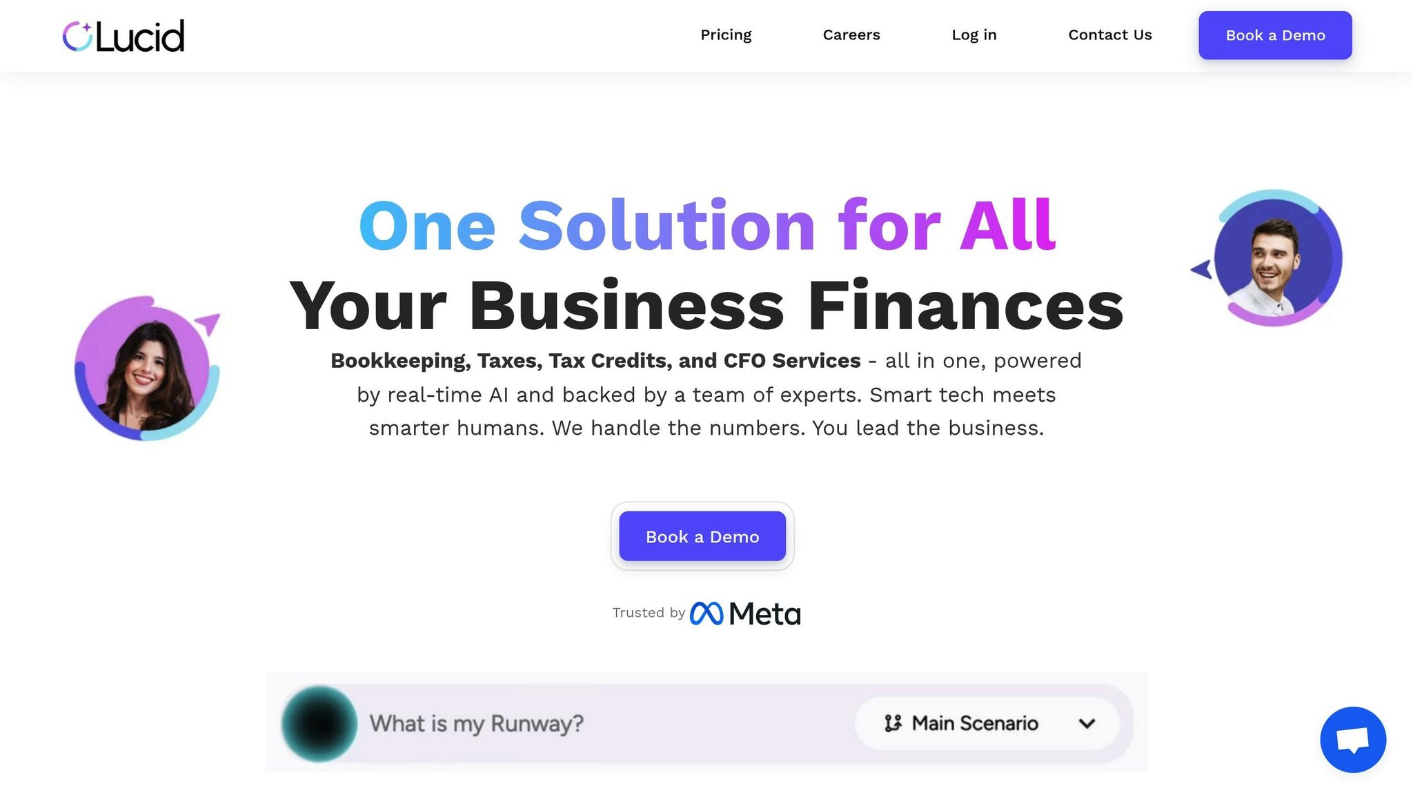
Creating visually engaging investor reports doesn’t have to drain your time or require a larger team. Lucid Financials uses advanced AI and thoughtful design principles to transform raw financial data into polished, impactful visuals. By blending automation with expert oversight, Lucid helps startups craft investor-ready visuals that clearly convey their growth narrative. This approach aligns seamlessly with the visual storytelling strategies mentioned earlier.
AI-Powered Financial Insights in Real Time
Lucid’s AI engine works continuously to process your data, delivering real-time dashboards that instantly show key metrics like cash flow trends, revenue growth, and expense breakdowns. Instead of waiting weeks for manually compiled reports, you get up-to-the-minute insights at your fingertips.
The platform also generates detailed financial scenarios, including best-case, worst-case, and realistic projections. For instance, if your monthly recurring revenue increases, Lucid’s AI updates growth charts and recalculates runway projections immediately, ensuring your visuals always reflect your current financial health.
What sets Lucid apart is its ability to create industry-specific benchmarks. If you’re running a SaaS business, for example, the system compares metrics like customer acquisition costs and lifetime value ratios against similar companies. This adds context to your visuals, helping investors see how your startup stacks up in the market.
Direct Integration with Slack for Instant Access
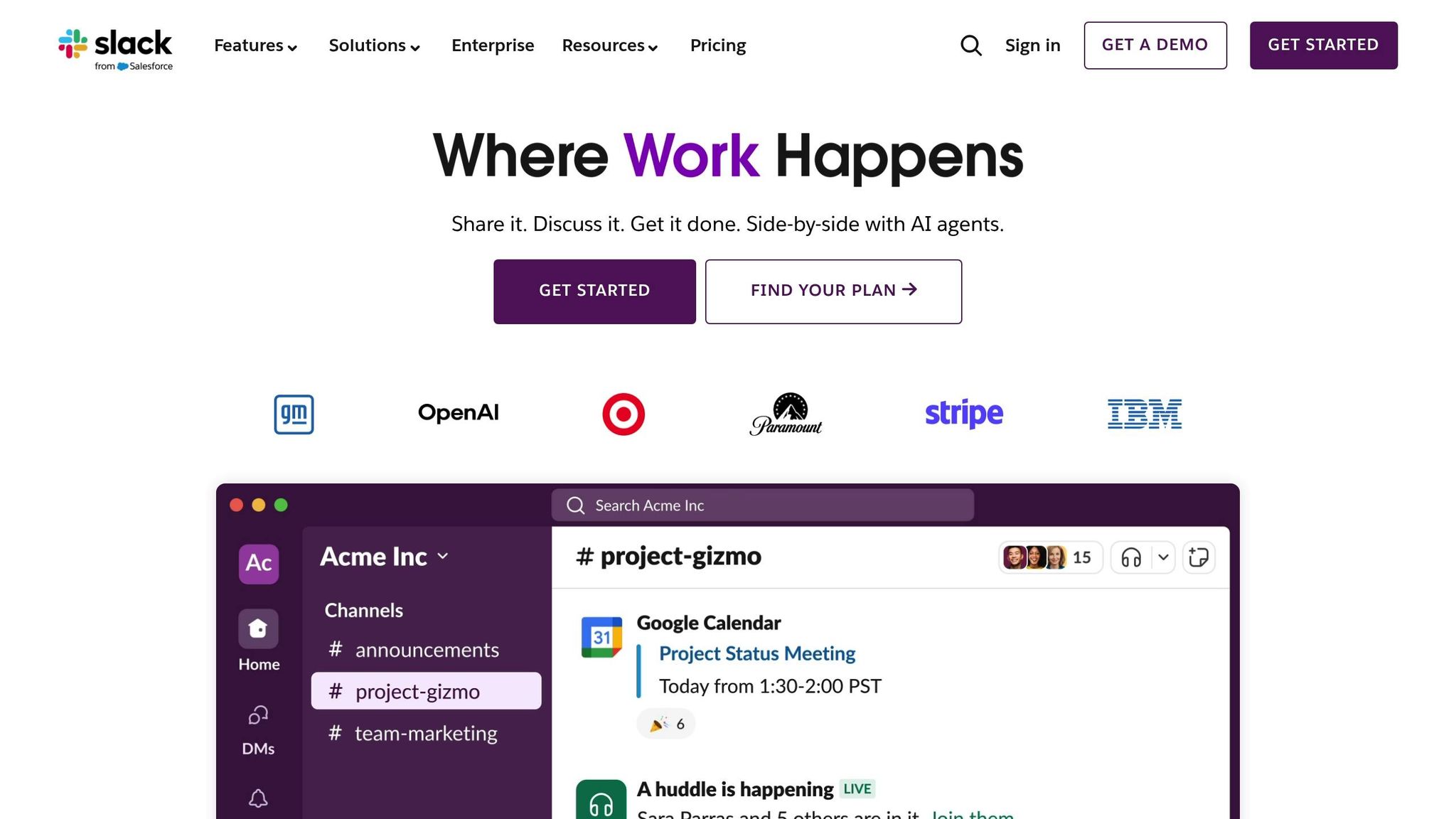
Lucid’s Slack integration makes accessing financial visuals incredibly fast. If an investor asks about your burn rate during a meeting, you can simply type a query in Slack and receive a formatted chart showing monthly burn trends - complete with projections for upcoming periods.
This feature ensures you’re always prepared for financial questions. Whether you need a revenue breakdown by customer segment or a visual showing how recent hires impact your runway, the answers are just a Slack message away. The natural language query system quickly generates AI-driven responses, supported by experts to ensure accuracy.
The Slack integration also helps during crunch times, like preparing for an investor presentation. You can request specific visual formats or clarification on metrics directly through Slack, saving time and reducing stress.
Clean Books and Always-Ready Investor Reports
Beyond real-time insights, Lucid ensures your financial records are always in top shape. The platform guarantees clean books within seven days and maintains their accuracy over time. Its AI automates tasks like transaction matching and reconciliation, while experienced professionals review everything to ensure compliance and precision.
This means your investor reports are always ready to go, not just during fundraising rounds. The system keeps your financial statements audit-ready, with visuals that update automatically after major revenue events.
As your startup grows - from pre-seed to Series C - Lucid tailors its visual reporting to your stage. Early-stage companies might focus on runway and growth metrics, while later-stage startups benefit from more advanced visuals like unit economics, cohort analyses, and market penetration charts. Every report is formatted professionally, complete with consistent branding that enhances your credibility during investor discussions.
With Lucid’s always-on approach, generating board-ready reports is as simple as clicking a button. Each report includes executive summaries and visually striking highlights of key performance indicators. The AI ensures every chart supports your growth story, while a dedicated expert team verifies that your financial narrative aligns with your business fundamentals.
Conclusion: Improving Investor Engagement with Visual Storytelling
Visual storytelling transforms complex financial data into clear, engaging narratives that resonate with investors. By swapping out dense spreadsheets for intuitive charts and interactive dashboards, you create reports that investors not only review but also remember.
The benefits are backed by cognitive research. Visuals are processed 60,000 times faster than text, and people retain 80% of visual information. This makes visual storytelling a powerful tool for stronger engagement. Take, for instance, a SaaS startup that introduced animated growth charts and customer journey maps into their reports. The result? A 30% boost in investor meeting attendance and glowing feedback on the clarity of their presentations.
Beyond making data digestible, visuals also create an emotional connection that can influence investment decisions. By quickly highlighting key metrics, visuals help reinforce confidence in your team’s strategic direction. In fact, 70% of venture capitalists have expressed a preference for visuals in reports.
Every aspect of your financial narrative benefits from this approach. Accuracy and professionalism are critical, but they must be paired with a compelling story of growth. Services like Lucid Financials offer AI-powered insights and investor-ready visuals - starting at $150 per month - making it easier to craft reports that are both precise and visually engaging.
At its core, visual storytelling isn’t just about making reports look better. It’s about building trust and showcasing your startup’s growth potential in a way that inspires confidence. When done well, your financial reports don’t just present data - they tell a story of progress and promise.
FAQs
How does visual storytelling make investor reports more effective and easier to understand?
Visual storytelling can revolutionize investor reports by presenting complex financial data in a way that’s both clear and engaging. Using tools like charts, graphs, and infographics, you can showcase key trends, performance metrics, and growth opportunities in a format that’s easy to understand and visually impactful. This saves time while making critical information more accessible.
For startups, adopting this method does more than just simplify communication - it creates a lasting impression on investors. Platforms like Lucid Financials make it easier to craft polished, investor-ready reports that combine sharp visuals with solid data. By prioritizing visual storytelling, you can make your message stand out while keeping the focus on the numbers that matter.
What are the best practices for choosing visuals to present financial data in investor reports?
When choosing visuals for financial data in investor reports, aim for clarity, relevance, and simplicity. Use visuals like bar charts to compare values, line graphs to show trends, and pie charts to illustrate proportions. These tools make complex financial details easier to digest. Keep the design clean - avoid unnecessary clutter and ensure every visual ties directly to the story you're telling.
Consider your audience when designing visuals. For instance, if you're showcasing revenue growth, a straightforward line graph with clear labels and consistent formatting can effectively highlight the trend. Always include concise titles and legends to help investors quickly understand the main points. Well-crafted visuals not only engage your audience but also help instill trust in your financial reporting.
How does Lucid Financials help make investor reports more engaging and accurate?
Lucid Financials simplifies the process of creating clear and visually appealing investor reports by blending advanced AI capabilities with expert insights. The result? Financial data that's always accurate, current, and easy to understand.
Thanks to real-time integration with tools like Slack, Lucid gives founders immediate access to polished financial records and investor-ready reports in as little as seven days. This means startups can concentrate on scaling their business while presenting professional, visually striking reports that leave a lasting impression on investors.