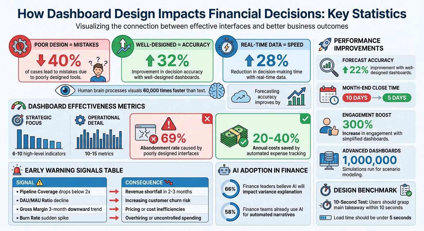
Financial dashboards can transform how startups handle data, saving time and reducing costly errors. Poorly designed tools lead to mistakes in 40% of cases, while well-designed dashboards improve decision accuracy by up to 32%. Here's how they help:
- Simplify decision-making: Clear visuals highlight key metrics like burn rate and cash flow without overwhelming users.
- Speed up responses: Real-time data cuts decision-making time by 28% and improves forecasting accuracy by 35%.
- Spot trends early: Dashboards flag issues like revenue gaps or churn risks before they escalate.
- Enable better planning: Interactive tools support "what-if" analysis and scenario modeling.
- Track goals effectively: Automated comparisons and visual cues (like color coding) ensure you're always on track.
Financial Dashboard Impact: Key Statistics on Decision-Making Accuracy and Cost Savings
How to Build Great Dashboards (5 Principles)
Effective design ensures that real-time financial insights are accessible and actionable for every stakeholder.
sbb-itb-17e8ec9
Core Principles of Financial Dashboard Design
Great financial dashboards turn complex data into meaningful insights. They give startups the tools to navigate financial challenges and make decisions with clarity. What sets effective dashboards apart? Three key principles: visual hierarchy, balancing simplicity with detail, and ensuring real-time data integration. Together, these elements create dashboards that guide action rather than overwhelm.
Visual Hierarchy Matters
When users scan a dashboard, they follow natural visual patterns. For instance, the top-left corner is prime real estate for the most critical KPIs, as that’s where users instinctively look first. A CFO should be able to glance at their dashboard and answer, "Are we on track?" within 10 seconds.
"If someone needs to ask what they're looking at… you've already lost." - F9 Finance
To make this work, group related metrics together and use size, color, and contrast to highlight their importance. For example, metrics like revenue, COGS, and gross margin should sit side-by-side rather than being scattered. Since the human brain processes visuals 60,000 times faster than text, key figures like cash runway should stand out in bold, large fonts.
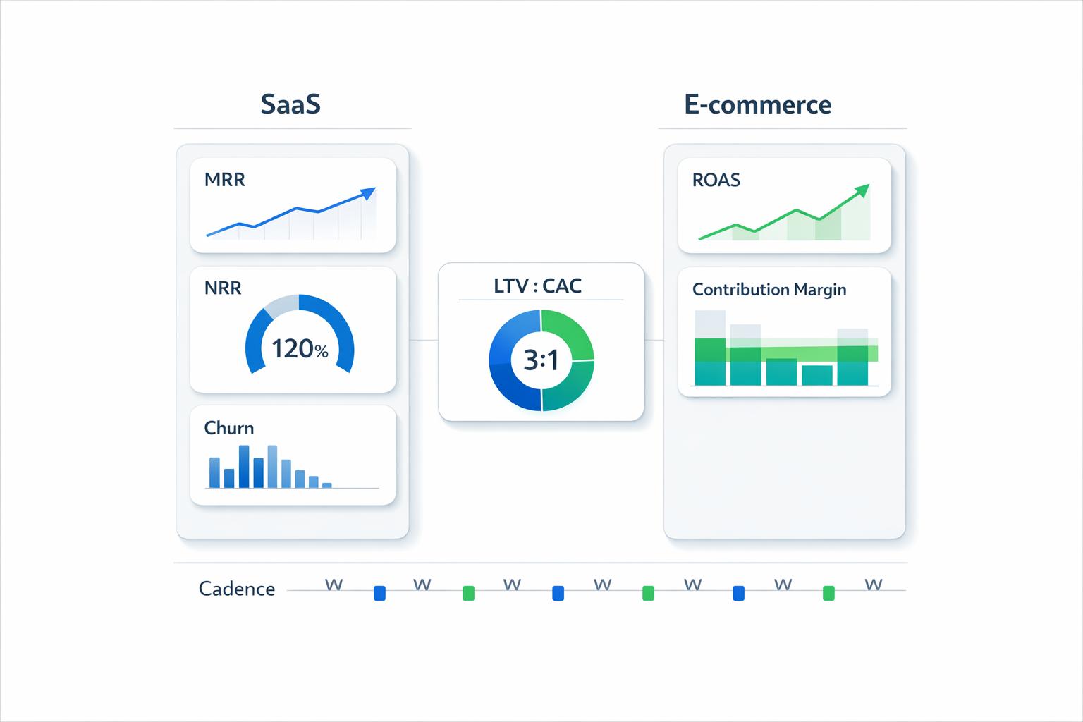
Strategic dashboards typically focus on 6–10 high-level indicators, while operational dashboards can handle a bit more detail, showcasing 10–15 metrics for in-depth analysis.
Balancing Simplicity and Detail
Financial dashboards need to show enough information for users to act without drowning them in data. The trick? Progressive disclosure. Start with a summary view - 3–5 core metrics with clear labels and comparison deltas. Then, let users drill deeper into the details when needed.
"In fintech, users often need the complexity visible... The design challenge is to show complexity clearly - not to remove it." - Anant Jain, Creative Director, Designpixil
This method can help combat the 69% abandonment rate caused by poorly designed interfaces. White space plays a big role here, separating data sets and making the layout easier to follow. Hover-over tooltips are another smart feature - they provide extra context without cluttering the main view, ensuring users can dig deeper without feeling lost.
Real-Time Data Integration
Static dashboards are like snapshots - they’re outdated the moment they’re created. Real-time integration, on the other hand, transforms dashboards into decision-making tools by pulling live updates from ERP, CRM, and accounting systems. Features like "last validated" timestamps and ledger reconciliation build trust and reduce manual errors.
The key is matching data refresh rates to decision needs. For example:
- Daily updates for cash and treasury positions
- Weekly updates for operating expense tracking
- Monthly updates for board-level reports
Real-time doesn’t mean second-by-second updates; it means the data is fresh enough to support timely decisions.
How Dashboards Improve Financial Decisions
Dashboards have transformed how startups approach financial decision-making. Marc Caposino, CEO of Fusedash, sums it up well:
"A financial dashboard is not an analytics tool. It's a signal board."
This distinction is crucial. Unlike traditional reports that overwhelm with excessive data, dashboards focus on the metrics that demand action. This shift helps founders and CFOs manage their businesses with greater precision and clarity.
Spotting Trends and Detecting Issues Early
Dashboards are designed to help leaders identify trends and spot problems before they escalate. By offering a bird's-eye view, they convert raw data into meaningful patterns. For startups dealing with unpredictable revenue and fluctuating costs, this clarity is invaluable. Dashboards help differentiate between random anomalies and trends that require immediate attention.
When issues arise, early detection is everything. For example, if a pipeline coverage ratio drops below 2x, it signals a potential revenue problem that could surface in 60 to 90 days. Similarly, a declining DAU/MAU ratio hints at reduced customer engagement, an early sign of churn. Real-time data integration ensures that urgent issues - like a broken payment page or a major customer leaving - are caught immediately, not weeks later.
Dashboards also allow users to drill down into specific areas. For instance, a 15% revenue gap can be traced back to the exact department or line item responsible. Monitoring expense categories through a dedicated dashboard can uncover wasted spending and redundant tools, potentially saving startups 20% to 40% in annual costs.
| Metric | Early Warning Signal | Potential Issue Identified |
|---|---|---|
| Pipeline Coverage | Drops below 2x | Revenue shortfall in 2–3 months |
| DAU/MAU Ratio | Consistent decline | Increasing customer churn risk |
| Gross Margin | 3-month downward trend | Pricing or cost inefficiencies |
| Burn Rate | Sudden spike vs. forecast | Overhiring or uncontrolled spending |
Testing Scenarios and Modeling Outcomes
Dashboards excel at "what-if" analysis, turning strategic planning into a more informed process. Leaders can tweak variables like pricing, demand, or costs and instantly see the impact on profits and cash flow. Advanced dashboards can even run up to 1,000,000 simulations to predict financial outcomes, offering visual insights into which scenarios are most likely to succeed or carry the most risk.
This functionality is especially important during strategic pivots. When actual revenue deviates from forecasts by 15% - a variance significant enough to grab board attention - interactive dashboards help pinpoint causes by breaking down data by region, product, or customer. Leaders can test pricing strategies, evaluate break-even points, and align hiring decisions with cash reserves. Dashboards also help time fundraising rounds by projecting burn rates against available funds.
The real game-changer is real-time forecasting. Dashboards compare actual performance against planned scenarios, highlighting variances that require action. As Arunangshu Das, Founder, explains:
"Dashboards do not simply monitor figures; they activate expansion."
This dynamic approach ensures that planning stays relevant and responsive.
Tracking Goals and Monitoring Performance
Dashboards simplify goal tracking by providing a quick, visual snapshot of performance. They automate comparisons between actual results and targets - whether it’s revenue versus forecast, headcount versus hiring plans, or gross margin against goals. This creates a strategic pulse check that answers "Are we on track?" in seconds.
Visual cues like color coding - green for on track, amber for caution, and red for immediate action - help leaders focus on what matters most. For example, a 5% revenue variance might prompt a discussion, while a 15% variance could demand urgent attention at the board level. In B2B startups, maintaining a pipeline coverage of 3x is critical, and falling below 2x signals a serious issue in the sales funnel.
Cash runway monitoring is another vital use case. For growth-stage companies, having less than 12 months of runway triggers strategic conversations, while less than 6 months demands immediate action. Dashboards tracking metrics like burn rate, revenue growth, and hiring pace allow founders to make proactive decisions. Even small variances, such as a 1–2% payroll discrepancy in a 200-person company, can lead to six-figure unplanned costs, highlighting the importance of precise performance tracking.
Design Features That Support Better Decisions
Dashboards that go beyond basic visuals can transform financial data into actionable insights. The most effective dashboards don’t just show numbers - they explain them, highlight problems, and allow users to dive deeper into the details.
Adding Context with Annotations and Insights
Numbers alone rarely tell the whole story. For instance, seeing a $150,000 revenue shortfall isn’t helpful without understanding the reasons behind it. Tools like waterfall and bridge charts break down variances into key drivers - such as price changes, shifts in volume, or product mix adjustments. Instead of a vague "Revenue down 8%", you get a clear breakdown of the factors contributing to the decline.
Annotations take this a step further by adding context directly to the visuals. If gross margin drops by 3%, a note like "Policy: New vendor contract terms" or "Market: Commodity price spike" can immediately clarify the cause. Research shows that 66% of finance leaders believe generative AI will have its most immediate impact in explaining forecast and budget variances, and 58% of finance teams are already using AI for automated narratives. Standardizing these annotations with consistent labels - like policy, market, or execution - makes it easier to categorize and address issues quickly.
"The goal is not pretty charts; it's faster, better capital allocation, risk control, and growth."
– Ameya Deshmukh, Integrail Corp
Using Alerts and Benchmarks Effectively
Visual alerts make it easier to spot issues at a glance. Red, yellow, and green indicators or status badges help decision-makers focus on what needs attention. For example, a dashboard showing unpaid invoices older than 45 days in red immediately flags a collections problem. Similarly, a dot chart can highlight sales teams that are at risk of missing their annual targets.
Benchmarks provide critical context by comparing actual performance to defined goals. Bullet and gauge charts are especially effective for this, showing whether you're ahead or behind. The use of color-coded thresholds works well because the human brain processes visual cues 60,000 times faster than text. To maintain clarity, it’s important to use red strictly for warnings and ensure that every alert prompts a specific action - like investigating a sudden drop in Monthly Recurring Revenue.
Interactive Tools for Data Exploration
Static dashboards answer past questions, but interactive tools allow for real-time exploration. Features like drill-down capabilities let users click on a summary metric - such as Gross Margin - to reveal detailed information by region, product, or customer. This can turn a 15% revenue gap from an abstract problem into a clearly defined issue.
Filters and slicers add flexibility by allowing users to switch between time periods, departments, or scenarios without needing new reports. For example, a CFO could start with Q1 performance, then instantly shift to year-over-year comparisons or filter by product line. Hover-over tooltips also provide quick definitions and explanations, making the data more accessible to non-finance executives.
Interactivity is especially valuable for root-cause analysis. If actual results differ from forecasts, selecting a specific region on one chart can update all related visuals to reflect localized performance. This transforms dashboards from static reports into dynamic tools that support decision-making. As f9finance.com puts it:
"Dashboards aren't supposed to be data dumps. They're supposed to tell a story. A useful one."
These interactive features lay the groundwork for evaluating dashboard performance, which is key to achieving better financial outcomes.
Measuring Dashboard Effectiveness
After implementing design principles, the next step is evaluating how well a dashboard performs. A dashboard's value lies in how efficiently it delivers insights. One key measure is time-to-insight: can users quickly identify issues and understand the data without extra effort? If users are left questioning what they're seeing, the dashboard isn’t providing the clarity it should.
Two benchmarks help assess this: the 10-Second Test and technical speed. If users can’t grasp the main takeaway within 10 seconds or if the dashboard takes longer than 5 seconds to load, it’s time to revisit the design. Quick load times and instant clarity are essential for success.
Another critical factor is user adoption. When stakeholders consistently use the dashboard instead of exporting data to spreadsheets, it proves the tool’s value. For instance, simplifying a cluttered dashboard to focus on four key KPIs can boost engagement by up to 300%. Similarly, creating role-specific dashboards has been shown to cut month-end close processes from 10 days to just 5. These adoption metrics pave the way for deeper success assessments.
Metrics for Dashboard Success
To evaluate dashboard success, it’s important to connect design improvements to measurable benefits. For example, transitioning from manual reporting to strategic analysis demonstrates clear progress. Well-designed dashboards can enhance forecast accuracy by 22% and reduce annual expenses by 20–40% through automated expense tracking.
Other useful metrics include shorter reporting cycles and a better balance between data preparation and analysis. When analysts spend less time cleaning data and more time generating insights, the dashboard is delivering real value. Additionally, having a single source of truth is crucial. Conflicting data across departments can erode trust, so automating data refreshes ensures that everyone works with the latest information, especially before critical meetings.
Real Impact on Financial Outcomes
Effective dashboards don’t just improve internal processes - they also deliver measurable financial benefits. For example, automated expense monitoring can cut annual costs by 20–40% by identifying unnecessary spending. Similarly, cash flow dashboards help startups track burn rates and runway, providing early warnings that can prevent "panic fundraising" when cash reserves dip too low.
"A financial dashboard... enables the founders to make fast and data-driven decisions on the business, which is what any business requires to survive the first year."
– Arunangshu Das
Dashboards also play a pivotal role in securing funding. Investors often prefer clear visuals over dense spreadsheets. By turning raw data into easy-to-read graphics, dashboards empower fast, informed decision-making - something every startup needs to thrive.
How Lucid Financials Delivers Better Financial Dashboards

Lucid Financials takes dashboard functionality to the next level, turning it into a tool that drives smarter decision-making. By incorporating AI and proven design principles, the platform focuses on clarity, speed, and actionable insights. Unlike traditional dashboards that rely on static reports and manual updates, Lucid uses AI to analyze data, identify anomalies, and create forecasts. This makes it more than just a numbers display - it’s a dynamic financial resource.
Features That Enable Better Decisions
Lucid Financials integrates seamlessly with Slack, bringing financial insights directly into a founder's daily workflow. Forget logging into multiple systems or waiting for monthly updates - ask questions in Slack, and instantly get updates on your runway, spending, or performance. This convenience reduces the barriers that often prevent teams from fully engaging with financial data.
The platform doesn’t stop at showing numbers. It consolidates data from various sources into a single, clear view. This means you can keep tabs on cash burn, revenue, and margins all in one place. Lucid also generates forecasts, alerts, and board-ready reports automatically. With its integrated approach, you’re always working with the most current data.
To ensure accuracy and security, MCP servers manage data access, and every AI-generated output is reviewed by finance professionals. This blend of automation and expert oversight ensures clean, reliable books in just seven days, keeping you ready for investors at all times.
Examples of Lucid Financials' Impact
The results speak for themselves. Startups using Lucid Financials benefit from faster insights, higher adoption rates, and better financial outcomes. Real-time visibility eliminates errors and saves time previously spent on manual spreadsheets. By automating expense tracking and offering early warnings about cash flow, the platform helps founders avoid last-minute fundraising scrambles and make informed decisions about spending and growth.
Conclusion
Research from Deloitte, Harvard Business Review, and Tableau highlights that effective dashboard design is a game-changer for smarter financial decision-making. Why? Because the human brain processes visuals 60,000 times faster than text. With this advantage, founders can instantly identify risks and opportunities, making decisions faster and with more confidence. When dashboards are designed with purpose - critical KPIs in the top-left corner, unnecessary clutter removed, and a focus on streamlined visuals - decision-making becomes less about overanalyzing and more about trusting your instincts.
For startups experiencing rapid growth, this clarity is not just helpful - it’s essential. A well-crafted dashboard takes raw data and transforms it into a clear, actionable snapshot of your business. This can mean the difference between scrambling for funding and staying prepared for investors. Simplicity is key: focus on 3–5 core metrics, ensure updates happen in real-time, and prioritize insights that drive action.
"Dashboards aren't supposed to be data dumps. They're supposed to tell a story. A useful one. One that helps decision-makers say, 'Aha, I get it - and now I know what to do.'" - f9finance.com
Studies have shown that role-specific dashboards can improve forecast accuracy by 22% and reduce month-end close times from 10 days to just 5. When designed effectively, dashboards don’t just track performance - they actively shape your company’s financial future with every glance.
Think of your dashboard like a car’s speedometer: you don’t need to understand the mechanics of the engine, just what the indicators mean for your journey. By applying the right design principles, your financial dashboard becomes more than a tool - it becomes a strategic partner. With every glance, it connects data clarity to business growth, helping startups refine strategies and maintain a competitive edge.
FAQs
What KPIs should a startup put on a financial dashboard first?
Startups need to keep a close eye on key financial metrics like cash flow, burn rate, revenue growth, and unit economics. These figures aren't just numbers - they're critical tools for making informed decisions and keeping track of the company's financial well-being in real time.
How often should financial dashboard data be refreshed?
Financial dashboards need to be updated continuously or in real-time to provide accurate and current insights. This is particularly critical for investor dashboards, which monitor live metrics such as cash flow and revenue. Real-time updates empower founders and stakeholders to make swift, confident financial decisions based on the most reliable data available.
How can I tell if my dashboard is actually improving decisions?
Dashboards are most effective when they link outcomes to their root causes, offer relevant context for the data, and enable users to test their assumptions in real time. Steer clear of dashboards overloaded with static KPIs that don't answer pressing questions or provide actionable insights.