Cash flow visualization helps you turn complex financial data into clear, actionable insights. By using tools like line charts, bar graphs, and dashboards, you can easily track trends, identify risks, and make informed decisions. Here's a quick summary of how to get started:
- Why It Matters: Poor cash flow management is a leading cause of startup failure. Visual tools help monitor your runway, detect unusual spending, and improve investor confidence.
- Data Preparation: Clean, accurate data is essential. Automate processes to reduce errors and organize data with consistent formats (e.g., $1,000 for positive, ($1,000) for negative).
- Visualization Techniques:
- Line Charts: Track trends over time.
- Sankey Diagrams: Show cash flow distribution.
- Bar Charts: Compare categories like spending or revenue.
- Heatmaps: Spot patterns and anomalies.
- Dashboards: Combine visuals into a single interface with key metrics (e.g., cash balance, cash runway). Use filters and drill-down features for deeper insights.
Tools like Lucid Financials simplify this process with real-time data syncing, forecasting, and expert advice. A clear cash flow visualization strategy ensures better financial management and decision-making.
How to Make a Cash Flow Chart in Excel | Easy To Follow Steps
sbb-itb-17e8ec9
Preparing Your Cash Flow Data for Visualization
Before diving into visuals, you need accurate, well-organized data. Skipping this step can undermine everything that follows. As Kevin Briscoe, Managing Partner at CFO Selections, wisely says:
"Your output is only going to be as effective as your input".
Gathering Accurate and Real-Time Data
The quality of your cash flow visualizations hinges on reliable data. It's not just about tracking revenue; it's about understanding actual liquidity. For example, you need to know when invoices are paid - not just when they're sent - and account for vendor credit terms or payment delays.
Automation can be a game-changer here. Manual data entry is prone to errors and slows down processes. Financial automation tools, like Lucid Financials, streamline reconciliation and can achieve a 98% auto-match rate in bank transactions. Lucid Financials integrates directly with your accounting software, delivering clean records in just seven days and keeping your data updated in real time. This ensures your visuals always reflect your current cash position.
Collaboration across departments is another key factor. Sales, procurement, and operations teams all play a role in shaping cash flow. For instance, a sudden increase in expenses might be tied to a planned inventory purchase, while delayed payments could stem from extended terms negotiated by sales.
The challenges of accurate forecasting are well-documented. Nearly 90% of treasurers at large companies are dissatisfied with their cash flow forecasting accuracy. Even more striking, only 28% of large global companies achieved cash forecasts within 10% of their annual free cash flow targets over a seven-year span. These numbers highlight how critical it is to get your data right from the outset.
Formatting Data for Visualization
Once your data is accurate, it’s time to structure it effectively. Use dollar signs ($) for currency, commas as thousands separators (e.g., $154,000), and decimal points for precision. Negative cash flow figures should be displayed in brackets - like ($1,000) - to make reports easier to read.
Your dataset should include consistent columns such as Opening Balance, Cash Received, Cash Spent, Net Cash Change, and Closing Balance. Organize these chronologically by month or quarter. Categorize inflows and outflows clearly: inflows might include Customer Receipts and Investing Inflows, while outflows could cover Supplier Payments, Payroll, Taxes, and Debt Payments.
For better readability, follow industry-standard formatting:
- Use blue for inputs, black for formulas, and green for references.
- Bold key totals.
- Round large numbers to the nearest thousand or million for high-level visuals.
Platforms like Lucid Financials can simplify much of this formatting. It standardizes your data and keeps it updated automatically, freeing you to focus on analysis instead of fighting with spreadsheets. With clean and well-structured data, you’ll be ready to move on to selecting the best visualization techniques for your cash flow insights.
Cash Flow Visualization Techniques That Work
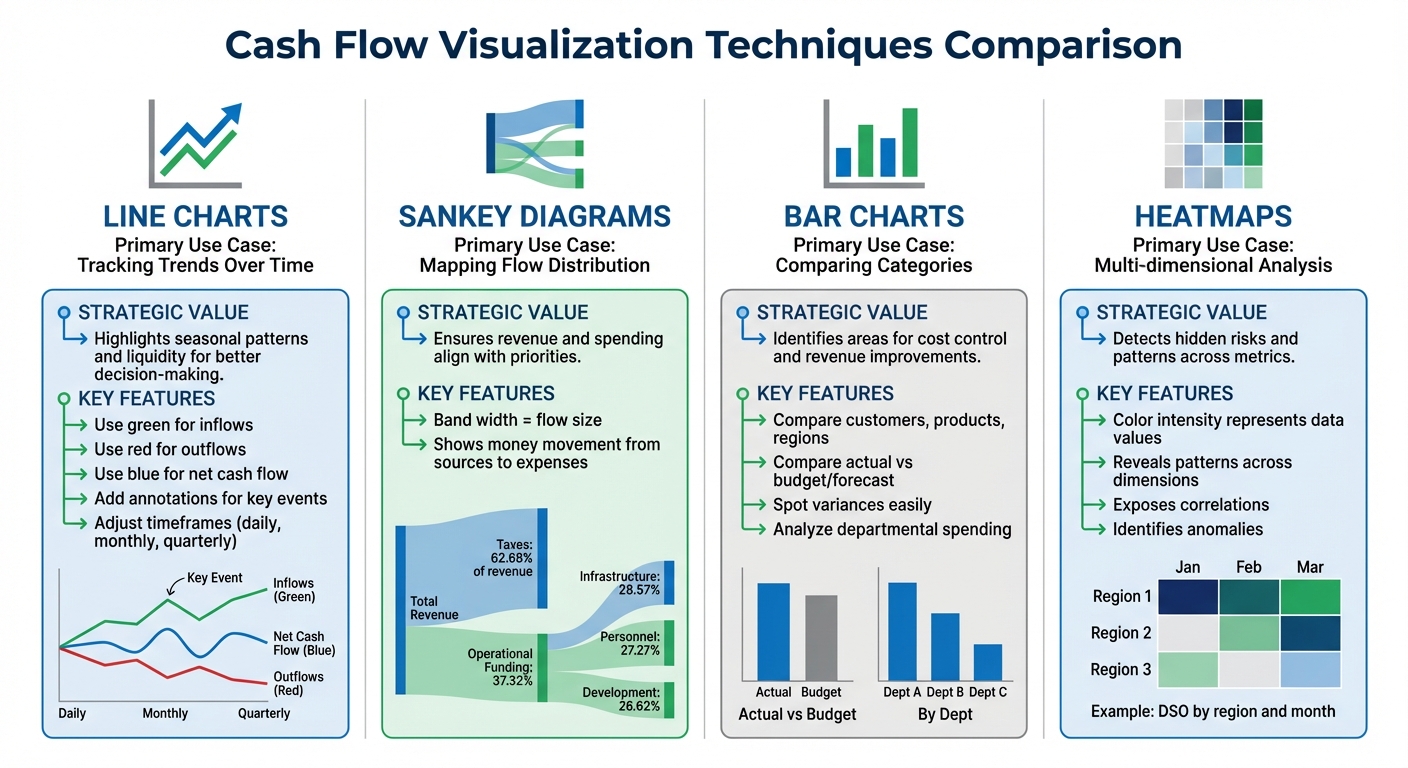
Cash Flow Visualization Techniques Comparison Guide
Once your data is clean and properly formatted, the next step is selecting the right visual tools to address your financial questions. Here are four visualization techniques to help you turn cash flow data into actionable insights.
Line Charts for Tracking Trends Over Time
Line charts are perfect for visualizing cash inflows and outflows over time, making it easier to spot trends, seasonal fluctuations, or unexpected changes. For example, you can identify periods when outflows exceed inflows, such as during annual tax payments, or when sales experience a sudden spike.
To make these charts clearer, use distinct colors - like green for inflows, red for outflows, and blue for net cash flow - and include annotations to highlight key events. For instance, you could mark a sudden increase in revenue from a funding round or a dip caused by a large expense. Adjust the timeframes to suit your needs: daily views for managing short-term liquidity or monthly and quarterly views for long-term planning. Including a net cash flow line is essential for a clear picture of overall gains or losses in each period. This approach supports quick, informed financial decisions.
Sankey Diagrams for Cash Flow Distribution
Sankey diagrams use proportional bands to illustrate how money flows from income sources to expenses. The width of each band represents the size of the flow, making it easy to see where funds are coming from and where they are going. These diagrams are especially helpful for analyzing complex distributions, such as tracing revenue from sales, loans, or grants to specific spending categories like departments or projects.
For example, a public finance Sankey diagram showed that taxes made up 62.68% of total revenue, while 37.32% of operational funding was allocated to health services. Similarly, a corporate budget analysis revealed a focus on digital infrastructure and human capital, with budgets split across Infrastructure (28.57%), Personnel (27.27%), and Development (26.62%). This tool is great for verifying that cash flows align with strategic goals. Thin flows representing small, scattered expenses may highlight opportunities to consolidate costs or improve efficiency.
Bar Charts for Comparing Categories
Bar charts are excellent for comparing cash inflows and outflows across different categories, such as customers, products, or regions. They provide a clear visual breakdown, making it easy to see which areas contribute the most to your overall cash position. For instance, you could use bar charts to compare payment terms across customers or analyze departmental spending to find high-cost areas.
These charts are also effective for spotting variances by comparing actual performance to budgets, forecasts, or historical data. This level of clarity can guide efforts to control costs and optimize revenue.
Heatmaps for Identifying Performance Patterns
Heatmaps are a powerful way to uncover patterns and anomalies that might not be obvious in spreadsheets. By using color intensity to represent data, heatmaps can reveal trends across multiple dimensions simultaneously. For instance, a heatmap showing Days Sales Outstanding (DSO) by region and month might highlight consistent collection issues in the Northeast during Q4.
They can also expose correlations between cash flow and net income across business units or pinpoint risks over time. These insights allow you to address potential problems before they escalate.
| Visualization Tool | Primary Use Case | Strategic Value |
|---|---|---|
| Line Chart | Tracking trends over time | Highlights seasonal patterns and liquidity for better decision-making |
| Sankey Diagram | Mapping flow distribution | Ensures revenue and spending align with priorities |
| Bar Chart | Comparing categories | Identifies areas for cost control and revenue improvements |
| Heatmap | Multi-dimensional analysis | Detects hidden risks and patterns across metrics |
Building a Cash Flow Dashboard
A well-designed dashboard transforms raw data into actionable insights. By integrating charts, tables, and metrics into a single interface, you can create a clear picture of your financial health at a glance. The goal is to make essential information instantly visible while also allowing for deeper exploration. Think of this dashboard as your go-to tool for monitoring cash flow in real time.
Designing a Clear Dashboard Layout
When designing your dashboard, focus on creating a logical visual flow. An F-pattern layout works well - place your most critical metric, like the current cash balance, in the top-left corner. This "Hero KPI" serves as your financial heartbeat, showing what funds are immediately available for spending or investing.
Organize the rest of the dashboard into three main sections:
- Operating Cash Flow: Tracks cash from your primary business activities.
- Investing Cash Flow: Reflects cash used for or earned from asset transactions.
- Financing Cash Flow: Covers cash from financing activities like loans or equity.
Use consistent color coding to make performance trends easy to spot. For example, green can signal positive cash flow, while red highlights negative figures. Keep the layout tidy by maintaining proper spacing - 16 pixels between cards and 24–32 pixels between sections. Use a 12- or 16-column grid for alignment. Don’t forget to include a "Last updated" timestamp so users know whether they're viewing the latest data or a static snapshot.
Adding Key Metrics and Interactive Filters
Stick to 3–7 key KPIs to maintain clarity. Gabriel Thiery, a builder at datawirefra.me, puts it well:
"The 'more is more' instinct is understandable... But from the user's perspective, excess metrics create clutter and dilute insights."
Focus on metrics that are essential for decision-making. Here are some examples:
| KPI | Formula | Purpose |
|---|---|---|
| Operating Cash Flow (OCF) | Operating Income + Depreciation – Taxes + Change in Working Capital | Tracks cash generated by core operations |
| Days Sales Outstanding (DSO) | (Accounts Receivable / Gross Sales) × Number of Days in Period | Measures how quickly invoices are collected |
| Days Payable Outstanding (DPO) | (Accounts Payable × Number of Days) / Cost of Goods Sold | Tracks the average time taken to pay suppliers |
| Cash Runway | Total Cash / Monthly Burn Rate | Estimates how many months of cash are left |
To make the dashboard even more user-friendly, add interactive filters for date ranges, business units, products, or customer segments. Place these filters consistently - either at the top or in a left-hand sidebar - and clearly display the active filter settings. This ensures users always know what data they’re viewing.
Lastly, include drill-down features for deeper analysis. For instance, clicking on total accounts receivable could open a detailed view of individual invoices, due dates, and client contact information. This functionality helps uncover the root causes of cash flow changes without requiring separate reports.
Using Lucid Financials for Better Cash Flow Insights

Lucid Financials offers AI-driven cash flow visualizations that update in real time, cutting down on hours of manual work for founders. Forget piecing together reports by hand - Lucid provides investor-ready dashboards that stay accurate as your business evolves. This real-time approach works perfectly alongside the dashboard tools mentioned earlier.
Real-Time Dashboards and Forecasting
Lucid syncs effortlessly with top accounting and ERP systems, as well as your bank accounts. This automatic integration keeps your cash flow data up-to-date, giving you an always-available view of your financial position without the hassle of manual data entry or reconciliation delays.
The platform uses intuitive waterfall charts to show how your cash flows from the opening balance to the closing position. Its AI digs into your historical data to create forecasts that closely align with actual outcomes, so you’re working with reliable predictions instead of guesswork.
Lucid also allows you to simulate different scenarios to see how decisions impact your cash flow. Considering hiring three engineers next quarter? Lucid shows how that affects your runway and cash position. Planning a big marketing campaign? Preview the cash flow effects before making a move. The AI-generated forecasts are ready to impress at board meetings or in investor updates.
CFO Support for Better Decisions
Lucid goes beyond visuals by pairing its insights with expert guidance to help you act quickly. Their CFO team takes the data from your dashboards and turns it into actionable strategies. Whether it’s hiring, tax planning, or scaling your business, you’re not just looking at charts - you’re making informed decisions.
You can even ask questions directly in Slack and get quick answers from Lucid's AI, whether it’s about your runway, spending trends, or performance metrics. For more complex issues, like deciding whether to extend vendor payment terms or speed up collections, Lucid’s CFO team steps in with tailored advice based on your real-time data. This blend of AI speed and expert judgment helps you act decisively, whether you’re gearing up for fundraising or navigating a challenging financial period.
Conclusion
This guide walked through the process of turning raw cash flow data into clear, actionable visuals. The key is starting with clean and accurate data. Pull information from various sources like income statements, balance sheets, and bank statements, and organize transactions into operating, investing, and financing activities. A solid foundation like this ensures your visuals accurately represent your financial trends, avoiding the risks of misleading data.
Selecting the right visualization method is just as important. Effective visuals not only simplify decision-making but also enhance financial reports, especially for investor presentations. When incorporated into a well-designed dashboard, these visuals provide a full picture of your financial health, helping you identify potential issues before they escalate.
Keeping your reports investor-ready is critical for both fundraising and strategic planning. Dashboards that compare actuals to forecasts allow you to catch irregularities early and make quick adjustments. With scenario analysis, you can test variables - like hiring plans or marketing budgets - and predict their impact on your cash flow and runway before making commitments. Tools like Lucid Financials combine AI-powered visualizations with expert CFO advice, offering real-time dashboards that adapt as your business grows, while also turning insights into actionable strategies.
FAQs
What’s the best chart for my cash flow question?
When it comes to choosing the best chart, it all boils down to the insights you're after. If you're tracking cash inflows and outflows over time, line graphs and waterfall charts are solid options. Line graphs are great for spotting trends and patterns, while waterfall charts help break down how different categories contribute to overall cash changes.
Need something more detailed or interactive? Dashboards with drill-down features can be a game-changer, allowing you to explore data at a deeper level. Your choice should depend on whether you're prioritizing big-picture trends or a detailed breakdown of the data.
How do I clean cash flow data before charting it?
To prepare cash flow data for charting, it's important to focus on refining the data's quality using effective methods. Start by spotting and fixing errors that could skew results. Next, remove duplicate entries to avoid inflating numbers. Address any missing values by filling them in appropriately or removing incomplete records. Finally, ensure all data follows consistent formats - whether it's dates, currency, or numerical values. These steps help eliminate inaccuracies, so your charts provide clear and trustworthy insights into your cash flow.
Which KPIs should a cash flow dashboard include?
A cash flow dashboard is a powerful tool for keeping tabs on your business's financial health. It should highlight key metrics that give a clear picture of cash positions, trends, and overall liquidity. Some essential KPIs to include are:
- Cash inflows: Tracks the money coming into the business.
- Cash outflows: Monitors expenses and other outgoing payments.
- Net cash flow: Shows the difference between inflows and outflows, providing a snapshot of cash movement.
- Cash balance over time: Displays how cash reserves change across specific periods.
These metrics are crucial for understanding liquidity, spotting trends, and making timely, well-informed financial decisions.