Investor dashboards simplify startup reporting by consolidating financial and operational data into one place. Instead of juggling spreadsheets, these tools provide real-time updates on metrics like cash flow, burn rate, and revenue growth, helping you and your investors make faster, data-driven decisions.
Key Takeaways:
- What it is: A dashboard that tracks key performance indicators (KPIs) in real time, pulling from tools like accounting software and CRMs.
- Why it matters: Saves time, reduces errors, and strengthens investor trust by delivering clear, polished updates.
- Core features: Real-time data integration, KPI tracking, and visual tools like charts and filters.
- Best practices: Keep it simple, automate data updates, and ensure accuracy to build trust.
Dashboards are more than just data - they tell a story about your company’s health and growth, giving investors the clarity they need to stay engaged.
Core Features of Investor Dashboards
The best investor dashboards turn complex data into clear insights, keeping stakeholders fully informed about your startup’s progress.
Real-Time Data Integration
A standout feature of modern dashboards is their ability to integrate directly with tools like accounting software, bank feeds, and CRM systems. This automation eliminates manual errors and ensures your data is always up-to-date. Instead of relying on spreadsheets, the dashboard automatically syncs live data, giving investors a clear view of your current financial position. This is especially critical for tracking key metrics like cash runway and burn rate, helping you catch potential issues - like sudden revenue dips or unexpected expenses - before they escalate. As Johnnie Walker, Co-Founder of Rooled, puts it:
"In 2025's fast-moving startup ecosystem, investors expect more than periodic updates - they demand real-time financial transparency".
By providing instant access to live data, your dashboard not only reduces surprises but also builds the trust needed for future funding rounds. This transparency encourages investors to stay engaged and proactive.
KPI Tracking and Custom Metrics
With live data feeds in place, effective dashboards focus on tracking the right metrics. They automatically monitor essential KPIs such as cash flow, revenue growth, CAC (Customer Acquisition Cost), and LTV (Lifetime Value). To avoid overwhelming users, dashboards typically highlight 3–5 key metrics for each business objective. As F9 Finance puts it:
"A finance dashboard is not just a collection of pretty charts... It's a decision-making tool. Full stop".
For instance, in 2023, a mid-sized manufacturer generating $120 million in revenue replaced chaotic Excel reports with three customized dashboards. The result? They cut their month-end close time in half - from 10 days to 5 - and boosted forecast accuracy by 22%.
Different stakeholders need different insights. Investors and executives often prioritize strategic KPIs like return on invested capital (ROIC) or EBITDA versus plan, while department heads focus on operational metrics like burn rate or collections efficiency. Customizable dashboards make it easy to cater to both audiences, all from a single data source.
Charts and Data Visualizations
To complement real-time data and KPI tracking, visual elements play a crucial role. Dashboards use tools like revenue breakdowns, burn rate trends, and progress charts to simplify complex financial data into clear, actionable insights. Color-coded indicators - red, yellow, and green - offer quick clarity on which areas need attention. Interactive features such as drill-downs and filters allow stakeholders to explore data by time period, department, or product line.
Best Practices for Building Investor Dashboards
Creating a dashboard that investors can rely on requires thoughtful design, accurate data, and regular upkeep.
Keep It Simple and Well-Organized
A dashboard should speak for itself. As F9 Finance wisely notes:
"If someone needs to ask what they're looking at… you've already lost."
Start by positioning the most critical metrics at the top - investors should immediately see key figures like revenue, burn rate, or cash runway without needing to scroll. Group similar data into sections: keep revenue metrics together, customer-related stats in another area, and financial health indicators in their own space. Use clear, straightforward labels and avoid unnecessary jargon. Since the human brain processes visuals 60,000 times faster than text, leverage charts and color coding to make insights pop without overloading viewers with text.
Maintain Data Accuracy and Consistency
The moment an investor doubts your numbers, trust is gone. As F9 Finance aptly puts it:
"Compromised data integrity undermines dashboard trust."
To avoid this, automate data updates to reduce errors from manual entry. Use a centralized dataset as your single source of truth to ensure consistency across all dashboards. Schedule automatic data refreshes and document how each metric is calculated to keep things transparent and reliable. Regularly validate your data to catch potential integration hiccups before they become bigger issues.
When your data is accurate, adding filtering options can make it even more powerful for investors.
Allow Customization and Filtering
Once your dashboard is well-organized and the data is verified, think about how customization can improve the user experience. Different investors have different priorities: some may want to see monthly trends, while others are more interested in quarterly comparisons or regional performance. Add interactive filters so users can sort data by time frame, department, product line, or geography - this eliminates the need for separate reports for every view.
Before rolling out the dashboard to all investors, test it with a small internal group for a week. This trial run helps identify any data discrepancies and ensures that filtered views remain accurate across all variables. A little extra effort here can make a big difference in how your dashboard is received.
Key Metrics Investors Want to See
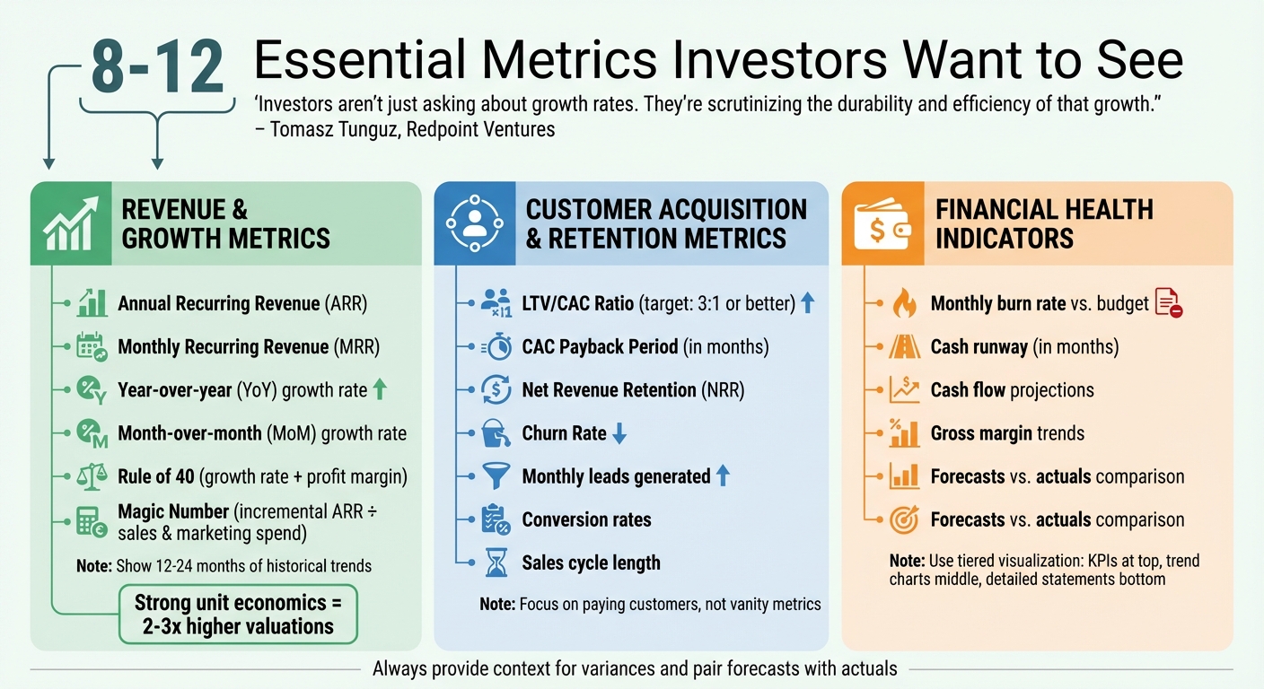
8-12 Essential Investor Dashboard Metrics: Revenue, Customer Acquisition, and Financial Health KPIs
A well-crafted investor dashboard should showcase the metrics that truly matter to investors. These numbers provide a clear snapshot of your company’s health, growth potential, and how efficiently you’re managing capital. As Tomasz Tunguz, Managing Director at Redpoint Ventures, explains:
"With the significant market correction we've witnessed, investors aren't just asking about growth rates. They're scrutinizing the durability and efficiency of that growth."
To keep things focused, aim for 8–12 key metrics. Any more, and you risk overwhelming your audience with unnecessary details. Below are the metrics that investors care about most, along with tips for presenting them effectively.
Revenue and Growth Metrics
Revenue metrics highlight your current scale and growth momentum. Key figures like Annual Recurring Revenue (ARR), Monthly Recurring Revenue (MRR), and year-over-year or month-on-month growth rates give investors a clear sense of how fast your business is scaling.
In addition to top-line revenue, include growth efficiency metrics such as the Rule of 40 (growth rate + profit margin) and the Magic Number (incremental ARR divided by sales and marketing spend). These indicators reveal whether your growth is sustainable or overly reliant on high spending. Use color-coded visuals and include historical trends spanning at least 12–24 months so investors can assess the trajectory, not just a single moment in time.
Avoid vanity metrics like "registered users" that don’t reflect real performance. Instead, focus on metrics like active users or paying customers, which provide a more accurate picture of engagement and revenue potential. Companies with strong unit economics often secure 2–3x higher valuations compared to peers with similar growth but weaker efficiency metrics.
But growth alone isn’t enough; understanding customer behavior is equally important.
Customer Acquisition and Retention Metrics
Metrics around customer acquisition and retention reveal your product’s market fit. The LTV/CAC ratio (Lifetime Value divided by Customer Acquisition Cost) is a key efficiency measure - investors typically look for a ratio of 3:1 or better. Similarly, the CAC Payback Period measures how many months it takes to recover acquisition costs, offering a clear view of capital efficiency.
For SaaS businesses, Net Revenue Retention (NRR) is critical. NRR tracks your ability to grow revenue from existing customers through upsells, cross-sells, and expansions - while accounting for churn. Including churn rate alongside NRR helps confirm whether your growth is sustainable and whether your product resonates with customers.
Provide context for these metrics. For example, include conversion rates, the number of leads generated monthly, and the length of your sales cycle. These details give investors a better understanding of how your growth engine operates.
Once growth and customer metrics are covered, it’s time to address financial stability.
Financial Health Indicators
Investors want assurance that your company won’t run out of money before reaching its next major milestone. The most critical financial health metrics include burn rate, cash runway, and cash flow projections. Display your monthly burn rate compared to budget using clear, color-coded visuals. Show your cash runway in months - this tells investors exactly how much time you have before needing additional funding.
Use a tiered visualization approach to present financial data. Start with high-level KPIs at the top, include trend charts showing the last 12 months of cash flow in the middle, and provide detailed balance sheets or cash flow statements at the bottom for those who want to dig deeper. Overlay gross margin trends on revenue charts to highlight the relationship between growth and profitability.
Always pair forecasts with actuals. Investors are more interested in where your company is going than where it’s been. As Christoph Janz, Managing Partner at Point Nine Capital, puts it:
"The best investor dashboards tell a coherent story at a glance, but also allow stakeholders to dig deeper when necessary."
Add brief notes to explain any variances. For instance, if revenue spiked due to a successful marketing campaign or if burn increased because of new hires, include those details. Numbers alone can be misleading - context turns them into actionable insights.
sbb-itb-17e8ec9
Building Investor Dashboards with Lucid Financials

Founders often find themselves bogged down by the tedious task of piecing together reports from scattered data sources. Lucid Financials steps in to eliminate this hassle, combining AI-driven automation with expert oversight to create polished, investor-ready dashboards - no manual effort required. Here's how Lucid's technology simplifies and enhances every step of the dashboard creation process.
AI-Powered Financial Reporting
Lucid's AI takes the reins by automatically generating reports and forecasts using real-time data. It extracts essential metrics like revenue growth, customer acquisition cost (CAC), and overall financial health, presenting them as clear, easy-to-read visuals. Think line charts for revenue trends, bar charts for sector comparisons, and gauge charts to track progress on key goals like fund deployment. Everything is formatted to U.S. standards, including currency symbols (e.g., $1,234,567.89) and date formats (MM/DD/YYYY).
The platform also delivers cumulative revenue reports and KPI summaries, complete with built-in validation tools that catch potential errors before they reach investors. And to ensure nothing slips through the cracks, Lucid's finance team reviews every AI-generated report for accuracy and compliance. The result? Professional-grade visuals and insights that are ready for boardrooms and investor meetings alike.
Slack Integration for Real-Time Insights
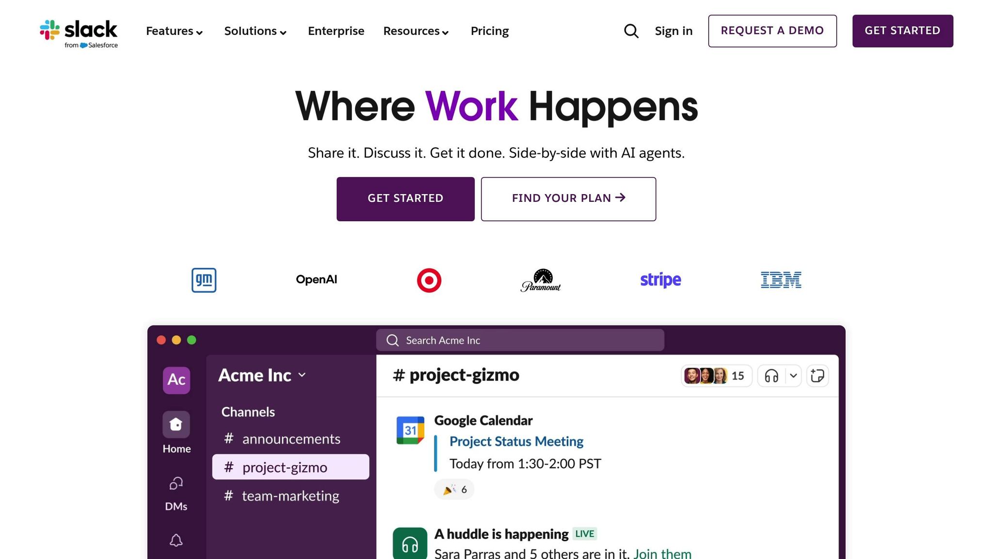
Lucid takes convenience a step further with its seamless Slack integration. Need to check on your financials? Just ask. Queries like "What's our current MRR growth?" or "Show Q1 revenue by customer segment" are answered instantly with dashboard-ready summaries or visualizations, delivered right within your Slack workspace. This real-time access makes it easier to respond to investor questions on the fly or prep for board meetings in record time.
The platform also allows on-demand filtering and customization, so you can zoom in on specific metrics or time frames without breaking stride. And Lucid doesn't just stop at data delivery - its team of experts is available via Slack to provide strategic advice, ensuring you’re not just informed but also prepared to act.
Always-On Investor Readiness
With Lucid, your financials are always up-to-date and audit-ready. The platform combines AI automation with human oversight to deliver clean, accurate books in just seven days. From there, it keeps your dashboards current through daily automated reconciliation. Standardized metrics like revenue growth, burn rate, and cash runway are formatted for quarterly reviews and secure sharing, making it easy to keep investors in the loop.
Startups using Lucid report fewer errors and faster turnaround times - what used to take weeks can now be done in days. Whether you're gearing up for a fundraising round, preparing for due diligence, or simply planning your next big hire, Lucid ensures your numbers are accurate and ready to share. This all-in-one approach not only enhances your credibility with investors but also frees you up to focus on scaling your business.
Conclusion
Investor dashboards turn raw data into actionable insights, allowing you to identify risks early and adjust strategies based on real-time updates. The best dashboards do more than just display data - they tell a story that drives meaningful business decisions. As F9 Finance explains:
"Dashboards aren't supposed to be data dumps. They're supposed to tell a story. A useful one. One that helps decision-makers say, 'Aha, I get it - and now I know what to do.'"
To create effective dashboards, focus on automation, simplicity, and clarity. Link them directly to your data sources to avoid manual updates, center them around 1–3 high-level goals with 3–5 actionable KPIs, and use a clear visual hierarchy - placing the most critical metrics in the top-left corner. And don’t forget the 10-second rule: if a stakeholder can’t grasp the main takeaway within 10 seconds, it’s time to revisit the design.
Streamlined dashboards deliver real results, cutting reporting time and improving forecast accuracy. For startups, maintaining financial clarity often determines whether a team can move quickly or gets bogged down in details.
Lucid Financials offers a solution by combining AI-driven automation with expert oversight. In just seven days, it delivers clean, U.S.-standard books and investor-ready reports. From automated reconciliation to polished, board-ready visuals, it handles the heavy lifting so you can focus on growth - not spreadsheets.
Whether you're preparing for a fundraising round or keeping investors updated, well-designed dashboards ensure you spend less time on reporting and more time driving your business forward.
FAQs
What are the main advantages of using an investor dashboard?
Investor dashboards bring valuable benefits to startups and rapidly growing companies by simplifying financial reporting and improving decision-making processes. These tools automate data collection, cutting down on manual tasks and reducing the risk of errors. Plus, they provide real-time updates on essential metrics like cash flow, burn rate, MRR/ARR, customer acquisition cost (CAC), and runway. This gives founders immediate clarity about their company’s financial standing, helping them make quicker, informed decisions.
Many dashboards now include features like AI-powered predictive analytics, which can identify trends, spot irregularities, and support forward-looking financial planning. They also enhance communication with investors by presenting clear, visually appealing reports that break down complex data. This transparency not only simplifies board meetings or fundraising discussions but also builds trust and confidence. Platforms like Lucid Financials take it a step further by integrating bookkeeping, tax services, and CFO support, allowing businesses to save time, manage costs, and always stay prepared with investor-ready reports.
How can I ensure my investor dashboard provides accurate and reliable data?
To keep your investor dashboard accurate and reliable, the first step is to cut down on manual data entry. Automating data imports from platforms like accounting software, payroll systems, and payment processors not only saves time but also minimizes errors. Real-time updates are another key factor, ensuring your figures stay current and don’t mislead investors with outdated information.
Another crucial step is to organize and prepare your data properly. Bring all your data sources - like QuickBooks or Stripe - into one centralized system. From there, clean up the data by eliminating duplicates, filling in missing details, and standardizing formats. For example, use U.S. currency with commas for thousands and dates formatted as MM/DD/YYYY. AI tools can be particularly helpful here, as they can spot inconsistencies or anomalies and flag them for quick resolution.
A platform like Lucid Financials can make this entire process much easier. It automates tasks like bookkeeping, tax reporting, and delivering CFO-level insights, all while syncing seamlessly with your financial tools. With built-in AI for reconciling data and detecting anomalies, you’ll always have accurate, investor-ready metrics at your fingertips.
What key metrics should I focus on in an investor dashboard?
When building an investor dashboard, it's important to focus on metrics that clearly showcase your company's financial health and potential for growth. Start with cash flow and runway metrics - figures like burn rate and cash runway are essential for evaluating how long your business can sustain itself financially.
You’ll also want to highlight revenue growth metrics such as Monthly Recurring Revenue (MRR) or Annual Recurring Revenue (ARR). These numbers demonstrate how scalable and predictable your income streams are.
Don't forget to include customer economics metrics like Customer Acquisition Cost (CAC), Lifetime Value (LTV), and the CAC-to-LTV ratio. These provide insight into how efficiently you’re acquiring and retaining customers. Additionally, keep a close eye on churn rates and profitability margins (both gross and operating) to track your business's long-term stability and performance. Together, these metrics give investors a well-rounded view of your company's overall trajectory.