AI financial visualizations are transforming how businesses manage and interpret their data. By combining automation with clarity, these tools streamline financial reporting and provide actionable insights in real time. Here’s what you need to know:
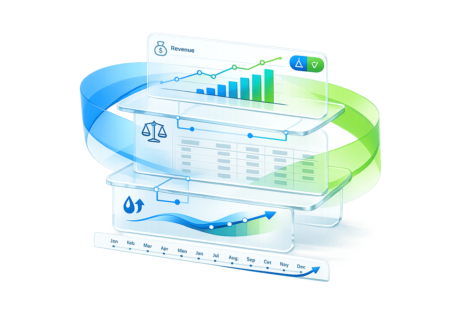
- Dashboards: Use them to track key metrics like revenue or burn rate. Keep them simple and focused on answering specific questions.
- AI Visuals: Go beyond the "what" to explain the "why." They analyze trends and provide context, turning raw data into actionable stories.
- Clarity: Each chart should deliver one clear message. Avoid clutter, stick to simple designs, and highlight key points with contrast.
- Scenario Modeling: AI can predict future trends and test "what-if" scenarios, helping teams make informed decisions faster.
- Audience Alignment: Tailor visuals to the needs of your viewers - whether investors, executives, or regulators.
- Real-Time Data: Integrate live data feeds to monitor financial health instantly and react quickly to changes.
- Human Expertise: Pair AI insights with human judgment to ensure accuracy, context, and compliance.
This approach allows businesses to shift from static reports to dynamic, real-time analysis, enabling smarter decision-making and more efficient workflows.
10 CFO Ready Dashboards Built by AI in Minute
1. Use Dashboards for Metrics, AI Visuals for Explanation
Dashboards are perfect for tracking the "what" - the critical numbers your business needs to monitor. Think of them as your financial control panel, offering real-time insights into metrics like monthly recurring revenue, burn rate, or gross margin. Each visual on your dashboard should serve a clear purpose, answering a specific question or highlighting a key takeaway. For instance, a gauge showing your current cash runway or a number card with net income provides an immediate, no-frills snapshot.
AI-generated visuals, on the other hand, tackle the "why" behind those numbers. While your dashboard might reveal a noticeable increase in software expenses last quarter, AI can dig deeper, analyzing historical trends to provide context. It might uncover that the rise aligns with new tool subscriptions or a shift to annual billing cycles. This added layer of explanation turns raw data into a narrative that stakeholders can easily understand and act upon.
"Context transforms a chart from a snapshot into a story." - CFI Team
To make this combination effective, keep your dashboards streamlined. Eliminate unnecessary elements like gridlines, borders, and redundant legends so the metrics themselves take center stage. Then, let AI handle annotations to explain significant changes - like a revenue drop tied to a lost contract or a payroll spike from seasonal hiring. This approach ensures your dashboards remain uncluttered while providing stakeholders with the deeper insights they need.
For even greater precision, focus on preparing your financial data in machine-readable formats like CSV files, rather than PDFs or overly stylized Excel sheets. Use clear, descriptive labels such as "Net Income" instead of ambiguous terms like "Amount." This structure allows AI tools to better identify patterns, detect anomalies, and flag issues like accounting errors or unusual spending trends that might require immediate attention.
2. Prioritize Clarity Over Complexity
The most effective financial visuals focus on delivering one clear message per chart. Trying to cram revenue trends, EBITDA, net income, and headcount into a single visual forces viewers to untangle multiple storylines, making it harder to grasp the main takeaway. Once complexity creeps in, the brain struggles to process the information quickly, defeating the purpose of using visuals in the first place. This is why clarity should drive every design choice, cutting out unnecessary clutter.
To make your visuals stand out, remove anything that doesn't directly support your message. Elements like heavy gridlines, 3D effects, shadows, or redundant legends only create distractions. Edward Tufte captures this perfectly: "You must give the viewer the greatest number of ideas in the shortest time with the least ink in the smallest space". A practical way to achieve this is by directly labeling data points and keeping your color palette limited to five distinct shades.
Here’s why this matters: 77% of organizations report improved decision-making when clear data visualization methods are used. Plus, people retain 80% of information presented visually, compared to just 20% of what they read in text form. By following these principles, you create visuals that not only engage but also support real-time decision-making.
Clarity is also key for driving timely and strategic decisions. Apply the five-second rule: if your chart’s core message isn’t obvious within five seconds, simplify it. Use contrast intentionally - a single bright color, like red, to highlight a critical drop, or bold text to emphasize an important figure. And don’t overlook consistency. Uniform fonts, number formats (e.g., "$0.00M"), and label styles across all your charts ensure viewers stay focused on the financial story you’re presenting.
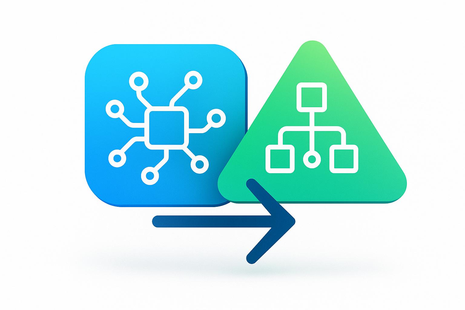
3. Use AI for Visuals Dashboards Cannot Create
AI goes beyond the limits of traditional dashboards by offering tools that not only display real-time data but also model future scenarios. Dashboards are great for presenting snapshots - like pie charts showing revenue breakdowns or KPI cards tracking monthly expenses. However, they struggle when it comes to predicting or exploring what lies ahead. This is where AI steps in, creating dynamic visualizations that adapt automatically as conditions change.
But it doesn’t stop there. AI adds another layer by delivering predictive insights that help forecast financial trends.
AI excels in predictive analytics and scenario modeling. By analyzing historical data, it can project trends such as cash flow or burn rate, updating these forecasts in real time. With tools like time-series forecasts, confidence intervals, and risk heatmaps, AI enables quick "what-if" analyses. For instance, when deciding whether to hire five new engineers or allocate $50,000 to marketing, AI lets you tweak variables like hiring costs or expected sales growth to instantly generate updated visuals. It can even highlight anomalies in past data to provide additional context.
This shift from static, backward-looking reports to dynamic, forward-focused analysis changes the game for finance teams. AI can process massive datasets from multiple sources, delivering detailed forecasts and early warnings about risks that traditional models might miss. Instead of relying on manual updates or juggling complex spreadsheets, AI suggests new perspectives, highlights trends automatically, and digs deep to reveal hidden patterns.
Unlike traditional dashboards, which require manual setup for each scenario, AI-powered tools allow for on-the-fly exploration. This flexibility supports faster planning, more frequent testing of scenarios, and better identification of financial risks before they become critical. For fast-moving startups, these dynamic visualizations turn reporting into a powerful strategic tool.
Lucid Financials leverages these AI-driven capabilities to provide real-time, forward-thinking insights that help guide smarter decisions.
4. Align Visuals with Your Business Goals
Every financial visualization should start with a clear objective. This goal determines the type of chart you choose and the metrics you emphasize. For example, if you're pitching Series A funding to investors, reviewing year-over-year performance with executives, or forecasting stock trends for board members, the purpose of your visualization guides the data you present and how you present it. This clarity ensures your visuals are tailored to meet the unique needs of investors, regulators, or executive teams.
It's also crucial to adapt visuals to your audience. Investors, for instance, often focus on metrics that highlight growth potential and competitive edge, such as customer acquisition costs, monthly recurring revenue trends, or burn rate projections. Regulators, on the other hand, prioritize compliance and transparent data methodologies. Similarly, a CFO analyzing quarterly budgets will need a different level of detail than a founder monitoring daily cash flow. Each visualization should address one specific question or deliver a single strategic insight. For instance, if you're showing a revenue decline, add a note explaining the cause - like losing a major contract during a particular month - to turn raw data into meaningful context.
Once you've identified your audience's needs, choose a format that best conveys your message. The type of chart you use should match your narrative: line graphs for trends, bar charts for comparisons, and gauges for KPIs. For single metrics, consider using number indicators, which provide quick updates without unnecessary distractions. The key is to let the function of the visualization dictate its form.
Finally, keep your designs clean and intentional. Avoid overusing bold colors, stick to consistent fonts and labels, and remove elements that don't add value. Using consistent color schemes across all slides reduces mental effort for your audience and builds trust. By focusing on purposeful design and aligning visuals with business goals, you transform data into insights that drive strategic decisions and reinforce the main message of your presentation.
sbb-itb-17e8ec9
5. Use Layered Communication for Board and Executive Presentations
Layered communication is all about tailoring insights to suit different decision-makers. Board members typically prefer high-level summaries, while executives often need detailed data. Structuring AI-generated visualizations in layers - starting with a broad overview and adding deeper details on demand - ensures you meet the needs of both groups effectively.
For board-level presentations, focus on a single key performance indicator (KPI) per visual. For example, instead of showing a complex chart with multiple revenue streams, present a clear figure for total monthly recurring revenue alongside a comparison to the previous quarter. This keeps the analysis straightforward and centered on strategic goals. On the other hand, executives who need to dive deeper into the data should have access to more detailed breakdowns. For instance, if a board slide highlights a revenue drop, the executive view might include revenue trends segmented by product line, customer group, or time period. This layered strategy ensures every audience gets the precision they need without overwhelming them.
To make your visuals as effective as possible, apply the "5 C's": clear messaging, minimal clutter, proper context, consistent formatting (e.g., "$0.88M"), and effective contrast. As the CFI Team emphasizes:
"The secret to contrast isn't in how much you use. It's in how intentionally you apply it".
By following these principles, you can ensure your audience - whether they’re looking for a quick overview or a deep dive - can quickly grasp the key takeaways.
For high-level presentations, keep visual complexity low. Stick to a limited color palette (no more than five colors) and remove unnecessary elements. This reduces mental effort, builds trust, and allows your audience to focus on the insights rather than trying to interpret the visuals.
Platforms like Lucid Financials demonstrate how AI-powered, layered visualizations can bridge the gap between strategic summaries for board members and detailed analyses for executives. This ensures that all stakeholders receive the information they need to make informed decisions.
6. Integrate Real-Time Data
Real-time data integration takes AI visualizations to the next level, turning them into live dashboards that update automatically as transactions occur. This means you can immediately detect expense surges, follow revenue patterns, and keep a close eye on cash flow as it happens - no waiting required.
AI-powered dashboards achieve this by connecting directly to your bank accounts, payment processors, and accounting software through APIs. These integrations ensure that key performance indicators (KPIs) are refreshed constantly, and they can even send alerts for unusual activity - like an unexpected expense that demands quick action. Instead of relying on monthly reports, you gain instant access to critical metrics like burn rate, runway, and monthly recurring revenue (MRR). This real-time visibility enables you to make decisions in the moment, not after the fact.
With real-time data, AI algorithms can instantly analyze trends and update visualizations. For instance, if you're reviewing Q1 revenue, you can quickly drill down into specific product lines or customer segments. This allows you to uncover emerging trends without waiting for custom reports from your finance team.
To get started, focus on a high-impact data source, such as your primary business bank account, and verify the accuracy of the data feed. Use tools with secure API connections - like Plaid or Codat - to maintain a steady data flow. Once you're confident in the reliability of the setup, expand to include other sources, such as credit cards or payment platforms. Some tools, like Lucid Financials, even integrate with Slack, letting you access real-time runway metrics through simple, plain-language queries.
As discussed earlier, speed and clarity are essential for fast-growing businesses. Real-time data integration isn't just a nice-to-have - it’s a necessity for staying ahead. By bringing live data into your AI-powered dashboards, you move beyond static reports and into proactive financial management. When your visualizations reflect the present moment, you can make decisions that keep pace with your business.
7. Combine AI Insights with Human Expertise
Merging AI-generated analysis with human judgment transforms raw data into meaningful, strategic insights. While AI excels at processing large datasets and generating visuals at lightning speed, humans bring the context, reasoning, and nuance needed to turn those outputs into actionable decisions.
For instance, AI might flag an unusual spike in an expense category. But it takes a human expert to interpret that spike - perhaps it’s not unexpected overspending but a planned expansion. This collaboration allows AI to handle the heavy lifting of identifying trends and anomalies, while human oversight ensures those findings are accurate and properly understood.
Human expertise becomes even more critical when it comes to compliance and accuracy. AI systems may occasionally miscategorize transactions or misinterpret data patterns. Accountants and financial professionals must review these outputs to ensure they align with GAAP standards and regulatory requirements. As Jorge Lluch, Co-Founder & COO of Abacum, puts it:
"The most successful implementations maintain a balance where AI handles data-intensive tasks while human experts focus on interpretation and strategy".
This "human-in-the-loop" approach not only helps catch errors early but also ensures that visualizations meet both technical and legal standards.
Another key strategy is establishing workflows where AI handles routine tasks while escalating complex issues to human experts. For example, Lucid Financials integrates with Slack to provide instant metrics while routing more strategic questions - such as those about capital allocation or fundraising scenarios - to financial specialists. This system keeps teams efficient without compromising on accuracy, fostering stronger decision-making at every level.
Finally, regularly retraining AI models based on team feedback ensures continuous improvement. If the system frequently misclassifies certain expenses or struggles with seasonal trends, human experts can adjust its logic for better future performance. This ongoing refinement combines the speed and efficiency of AI with the dependability of human expertise, creating a system that’s both agile and reliable.
Comparison Table
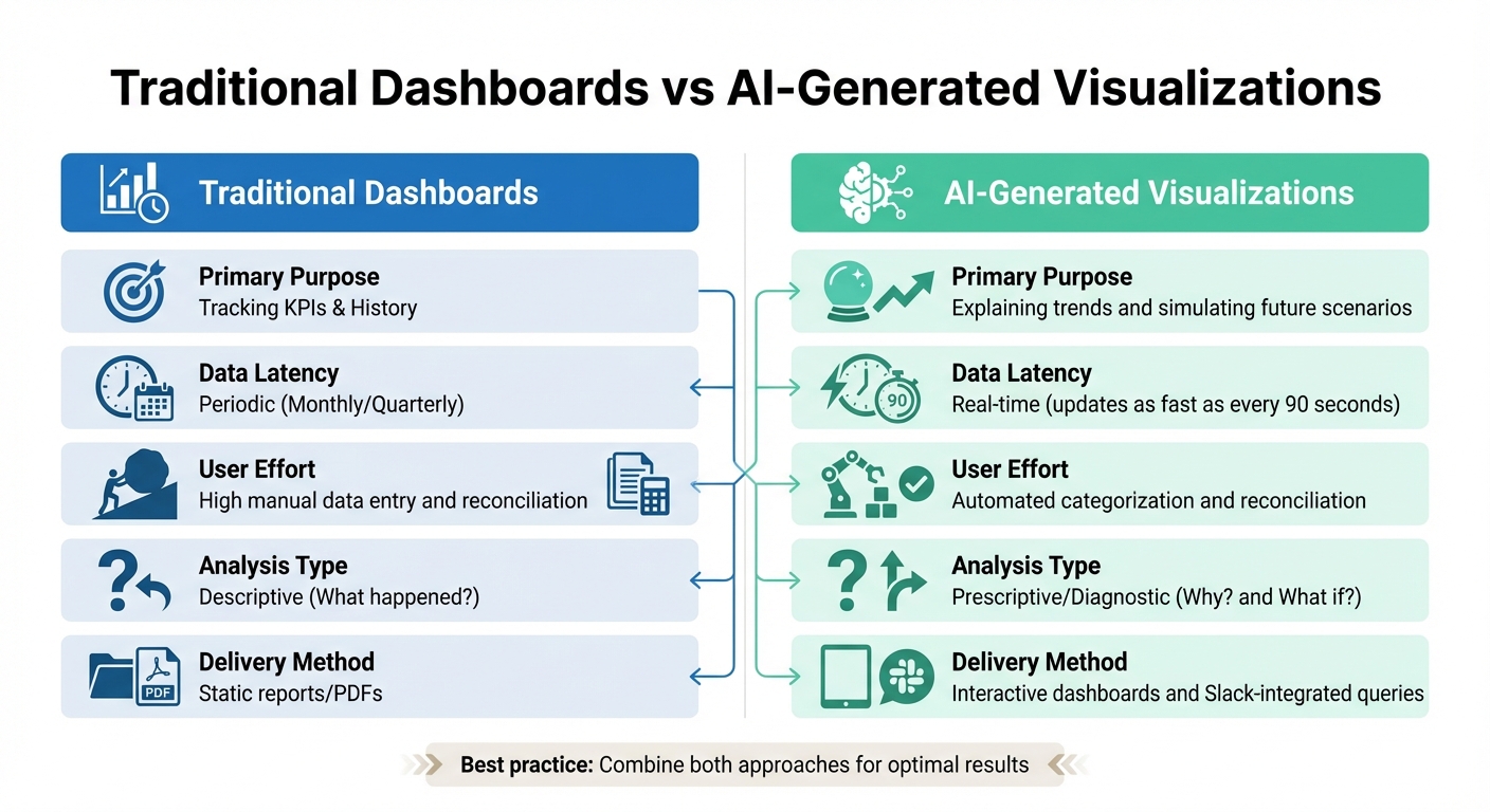
Traditional Dashboards vs AI-Generated Financial Visualizations Comparison
When comparing traditional dashboards with AI-generated visuals, their roles and strengths become clear. Traditional dashboards are excellent for tracking key performance indicators (KPIs) and reviewing historical metrics. However, they can quickly become overwhelming when trying to present too much data at once - imagine a single view attempting to combine revenue, EBITDA, and headcount. This clutter often makes it harder for users to extract meaningful insights. On the other hand, AI-generated visuals focus on explaining trends, using plain-language narratives to clarify the "why" behind the data and its implications for your business.
Another key difference lies in how data is delivered. Traditional reporting typically follows monthly or quarterly cycles, offering static snapshots that may already feel outdated by the time they're reviewed. In contrast, AI-powered systems provide real-time updates, sometimes as frequently as every 90 seconds. This immediacy allows teams to identify problems - or seize opportunities - before they escalate. These differences highlight how each format serves unique purposes.
| Metric | Traditional Dashboards | AI-Generated Visualizations |
|---|---|---|
| Primary Purpose | Tracking KPIs & History | Explaining trends and simulating future scenarios |
| Data Latency | Periodic (Monthly/Quarterly) | Real-time (updates as fast as every 90 seconds) |
| User Effort | High manual data entry and reconciliation | Automated categorization and reconciliation |
| Analysis Type | Descriptive (What happened?) | Prescriptive/Diagnostic (Why? and What if?) |
| Delivery Method | Static reports/PDFs | Interactive dashboards and Slack-integrated queries |
A crucial distinction lies in the type of analysis each tool provides. Traditional dashboards focus on answering "What happened?" by presenting historical data. AI-generated visuals go deeper, tackling questions like "Why did this happen?" and "What if we change our approach?" through diagnostic insights and scenario modeling.
For effective financial communication, it's not about picking one tool over the other - it’s about combining their strengths. Use traditional dashboards to monitor high-level metrics during routine check-ins. When deeper explanations or strategic planning are needed, turn to AI-generated visuals. This layered strategy ensures your team benefits from both the efficiency of automation and the insights required for confident decision-making.
Conclusion
Creating effective AI-driven financial visualizations goes beyond automation. It’s about delivering clarity, aligning with strategic goals, and harnessing real-time data to enable smarter decision-making. Transitioning from static monthly reports to dynamic, AI-powered visuals isn’t about replacing human judgment. Instead, it’s about relieving finance teams of routine tasks so they can focus on interpreting data and understanding the deeper "why" behind the numbers.
The combination of AI automation and human insight is key to achieving meaningful results. This approach enhances efficiency while allowing finance professionals to refine AI-generated analysis with their expertise.
"AI should augment human expertise, not replace critical thinking." - Jorge Lluch, Co-Founder & COO at Abacum
By blending AI's ability to manage repetitive, data-heavy tasks with human expertise for contextual interpretation, organizations can shift their focus from merely reporting "what happened" to addressing "why it happened" and planning "what to do next."
For example, automating tasks like invoice capture and bank reconciliation can improve data clarity and free up time for strategic work. Integrating financial data with tools like Slack ensures that stakeholders can quickly access key metrics, while human oversight maintains data accuracy. Even a single error in a visualization can erode trust with investors or board members, making this balance essential.
These practices illustrate how dynamic financial reporting can transform decision-making. At Lucid Financials, we apply these principles to deliver AI-powered financial visualizations that provide real-time insights and actionable clarity. This empowers startups and fast-growing companies to make decisions with confidence.
FAQs
How does AI improve the clarity of financial visualizations?
AI makes financial visualizations easier to grasp by turning complicated data into straightforward, engaging visuals. It automates the creation of charts, dashboards, and other elements, ensuring that critical metrics, trends, and comparisons stand out. This approach helps stakeholders like founders, investors, and team members quickly access and act on financial insights.
Many AI-driven tools also come with interactive features like filters, drill-down options, and real-time updates. These allow users to explore data dynamically, zeroing in on the insights that matter most. By organizing and presenting data in a clear and visually appealing way, AI reduces confusion, lowers the chances of misinterpretation, and supports smarter decision-making.
Why is real-time data important in AI-powered financial dashboards?
Real-time data plays a key role in AI-powered financial dashboards. It provides instant updates, ensuring you always have the most accurate and current insights into your financial metrics. This immediacy supports faster, well-informed decisions and helps spot trends or problems as they emerge.
By leveraging real-time data, businesses can enhance forecasting precision and address risks as they arise. Staying ahead of shifts allows companies to respond effectively, promoting stronger financial stability and uncovering growth opportunities.
Why is human expertise still essential in AI-powered financial analysis?
AI can process and visualize data at lightning speed, but it often falls short when it comes to understanding the bigger picture. That’s where human expertise steps in. Skilled professionals can interpret the story behind the numbers, evaluate which metrics matter most, and tweak strategies to align with organizational goals or shifting market trends.
Human oversight also plays a crucial role in refining AI-generated visualizations. Whether the audience is investors or board members, experts ensure that the data is presented clearly and accurately. They can spot errors, address biases, and translate raw insights into actionable strategies. By combining AI's efficiency with human judgment, organizations can achieve smarter, more reliable financial decisions.